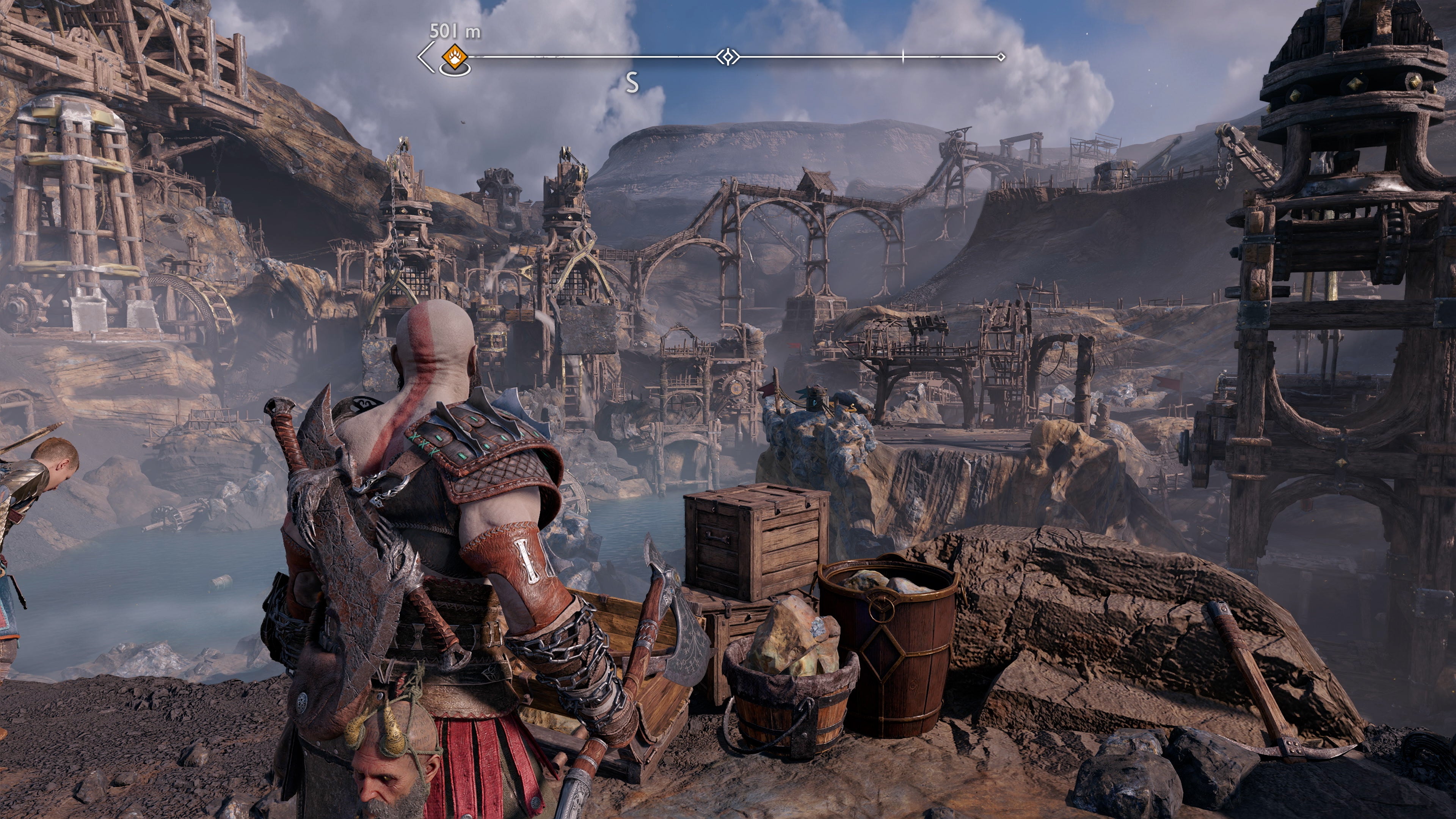
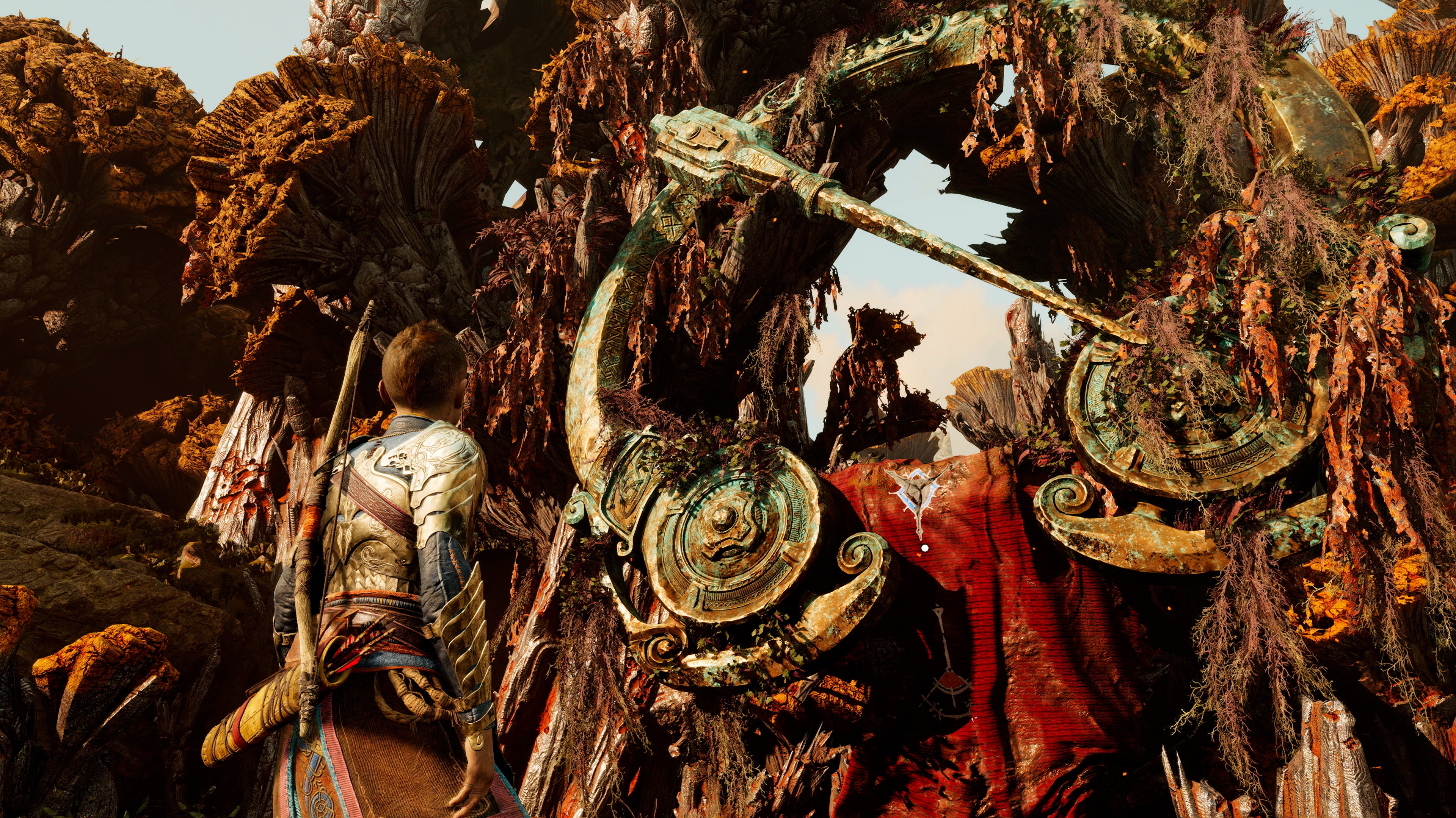
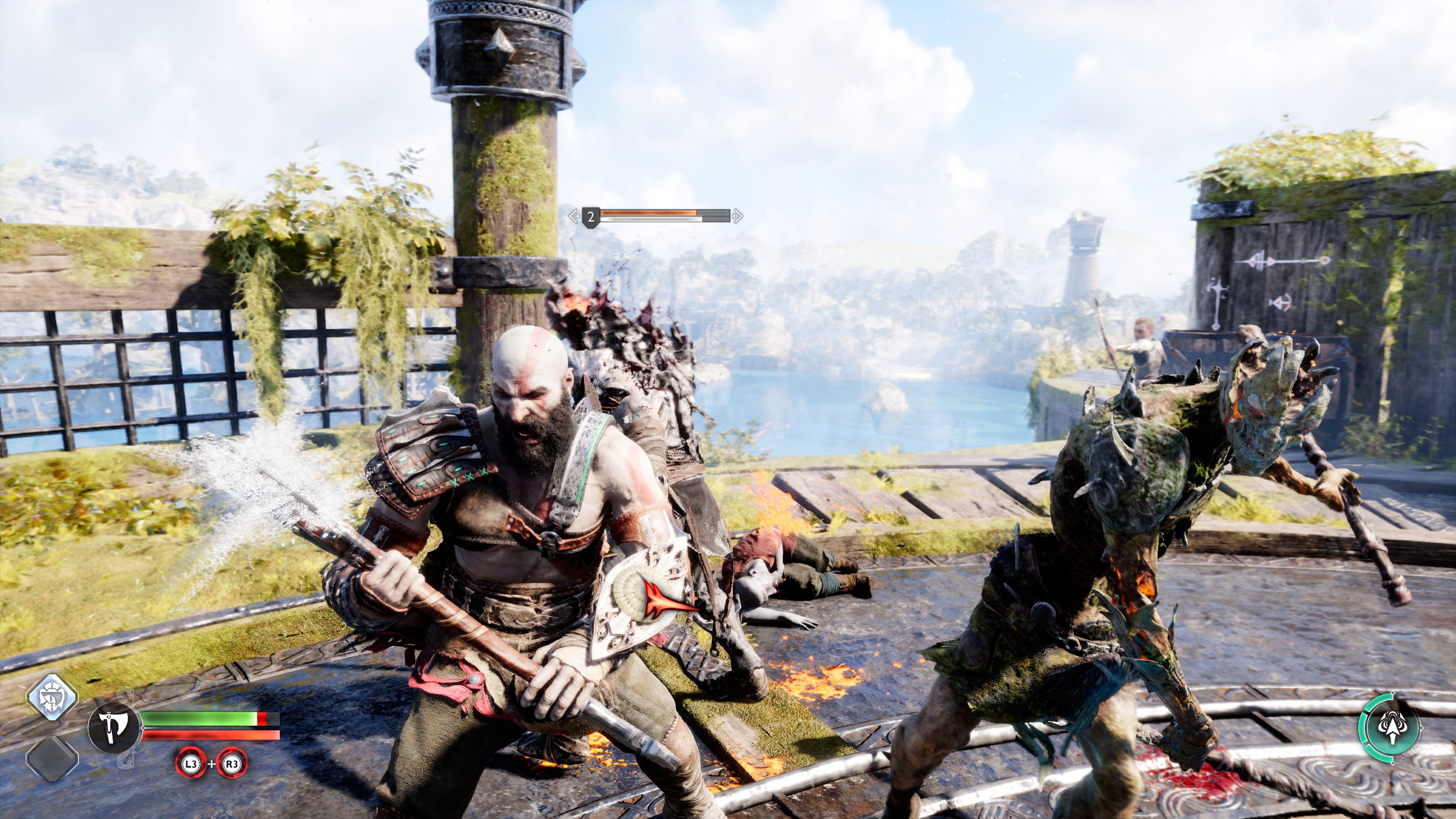
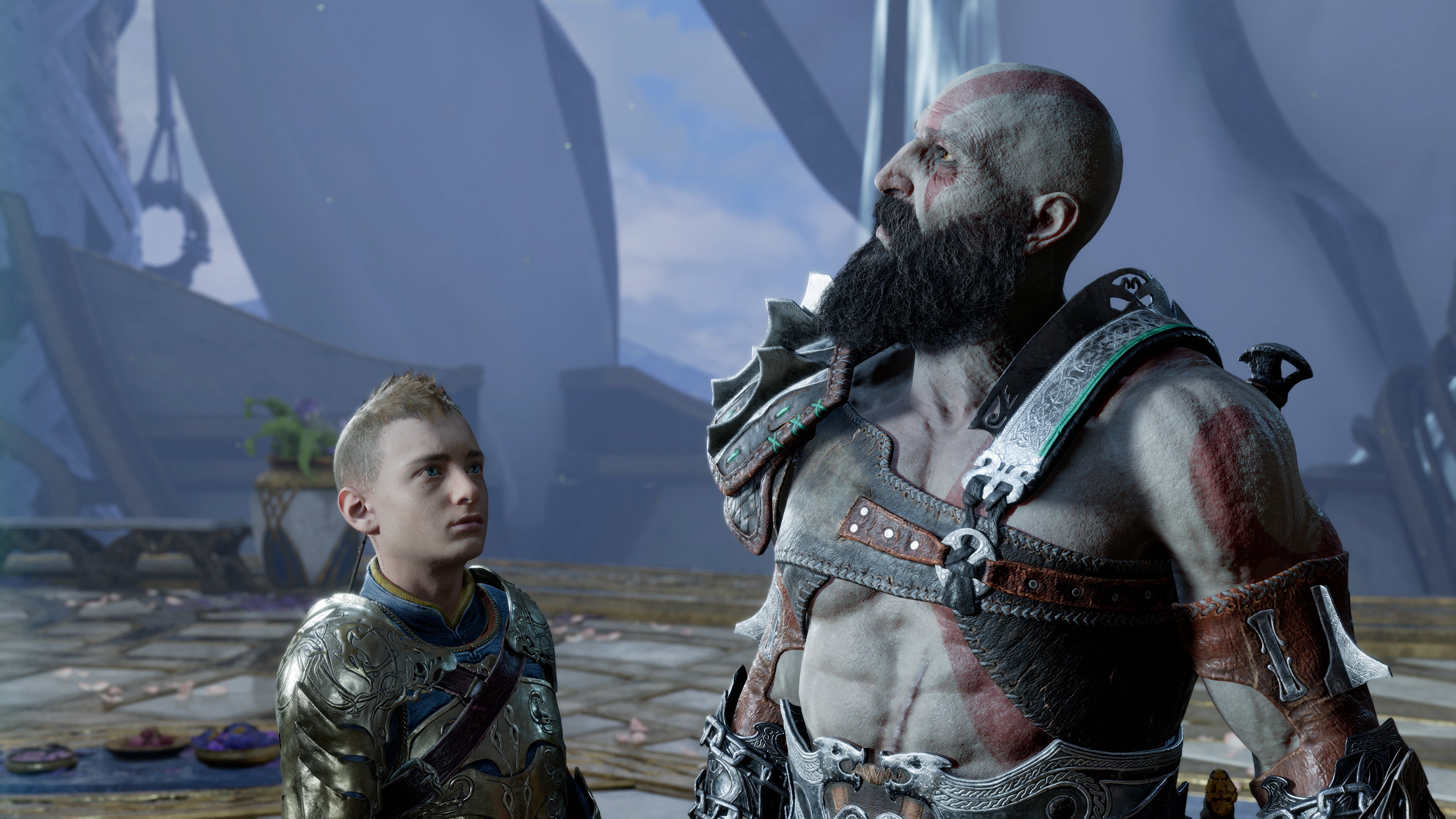
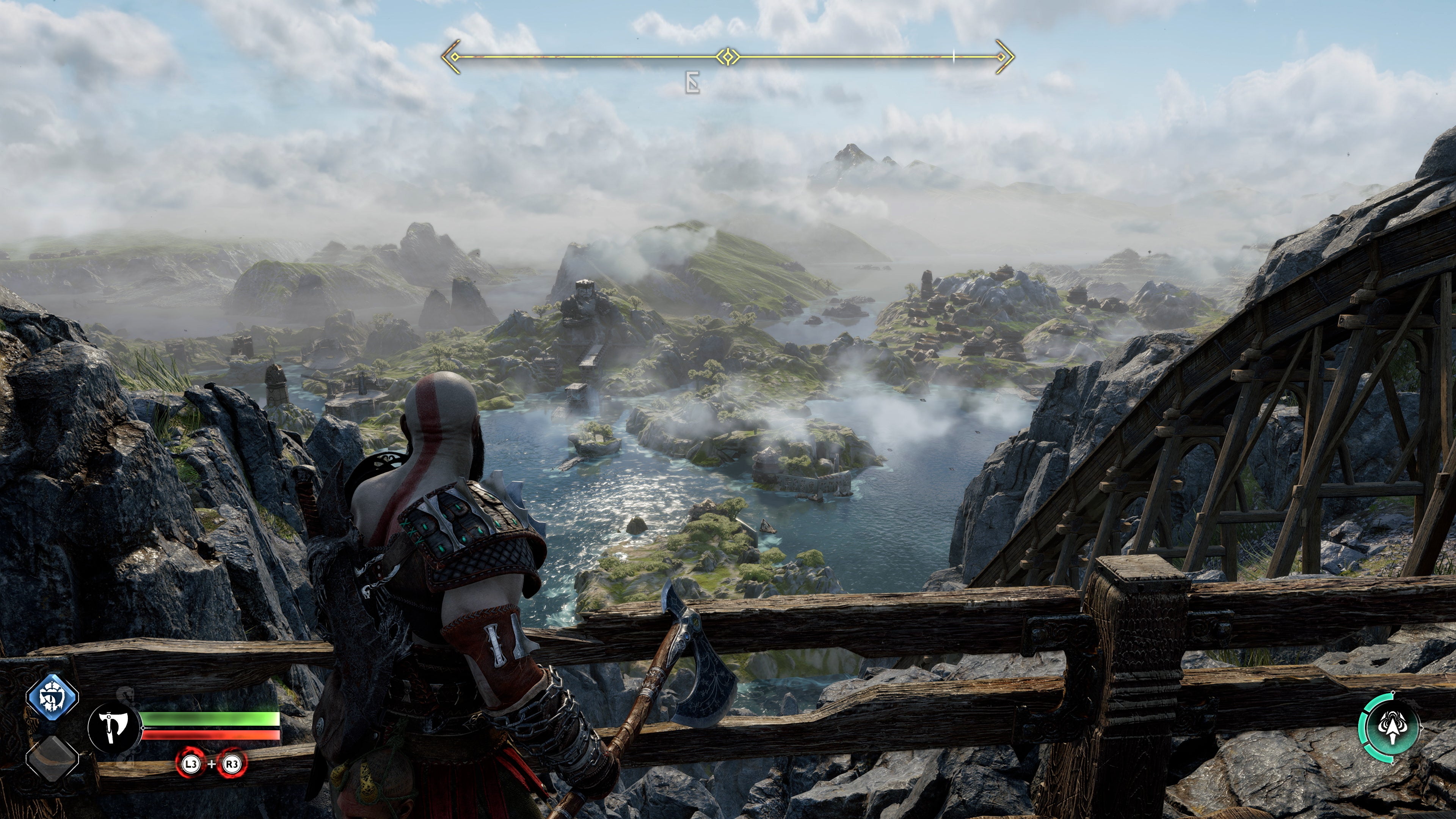
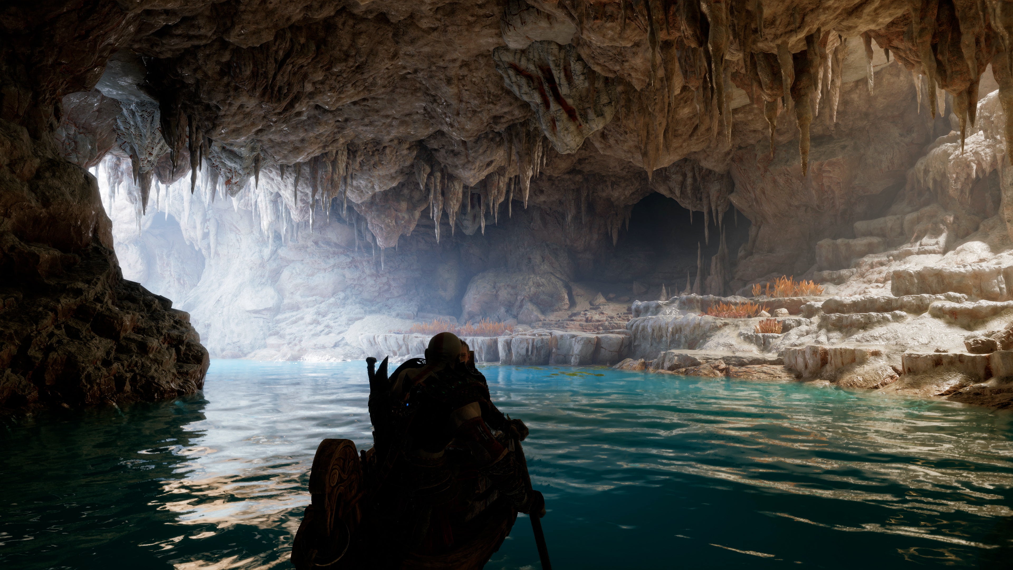
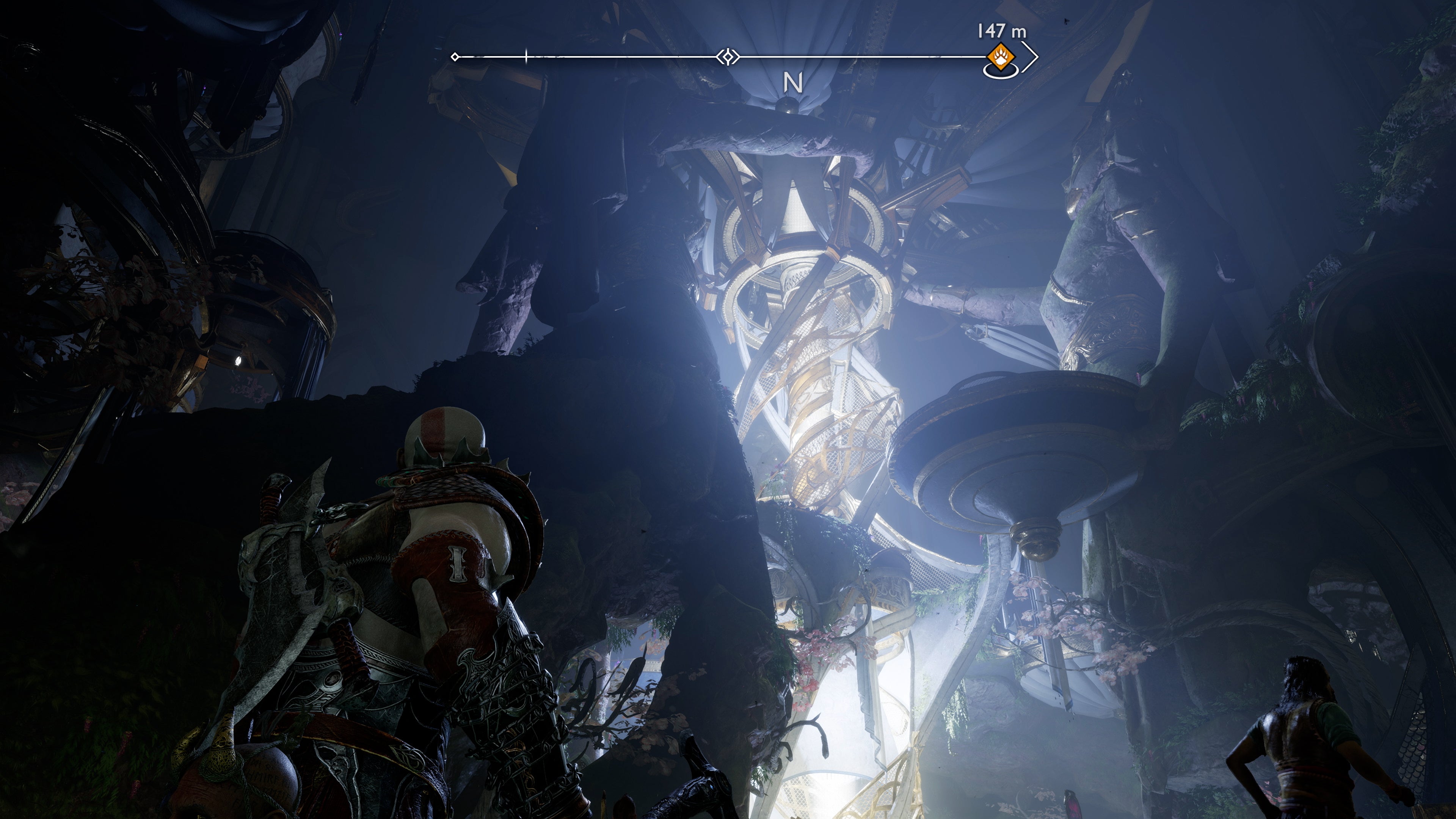
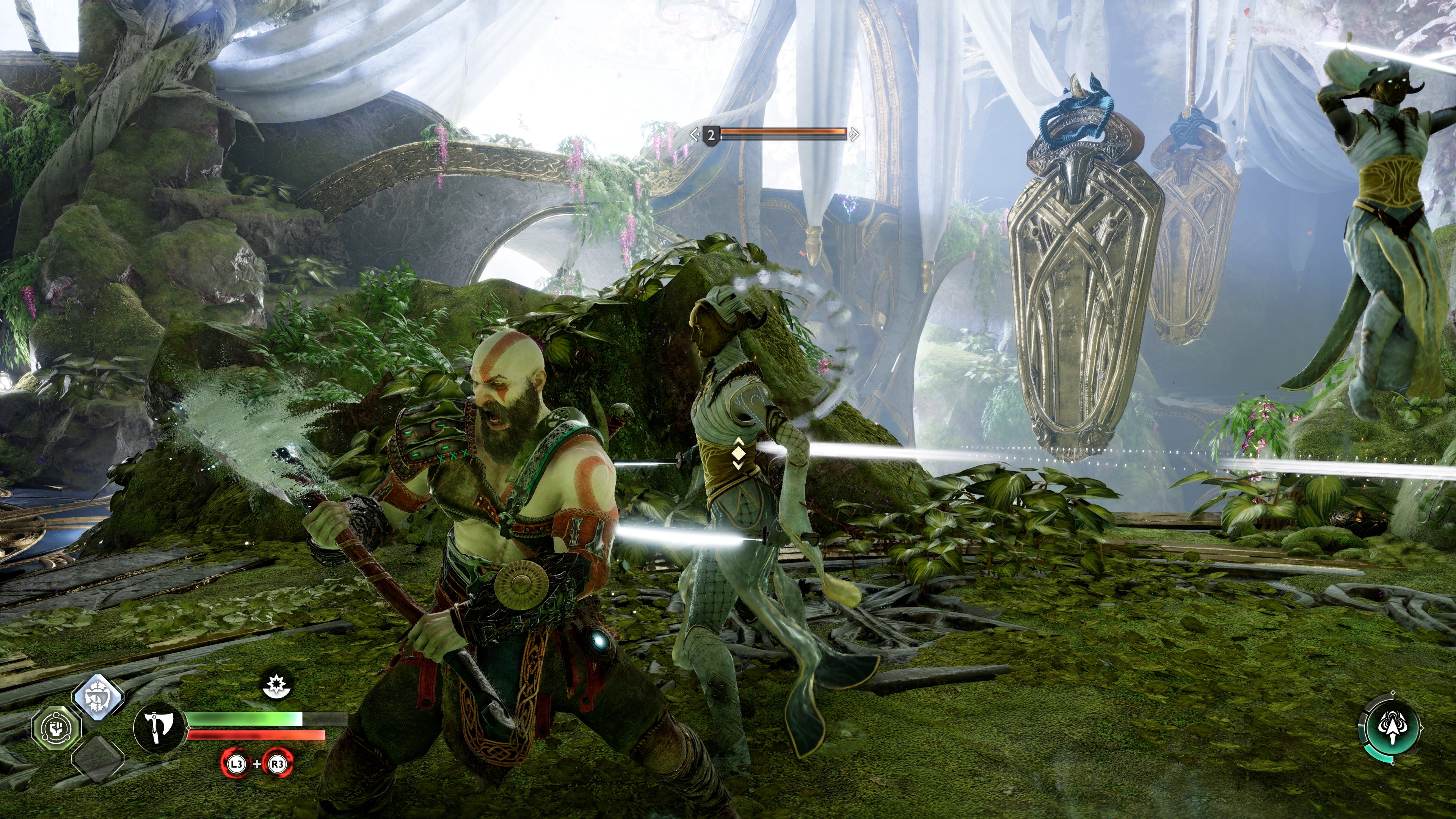
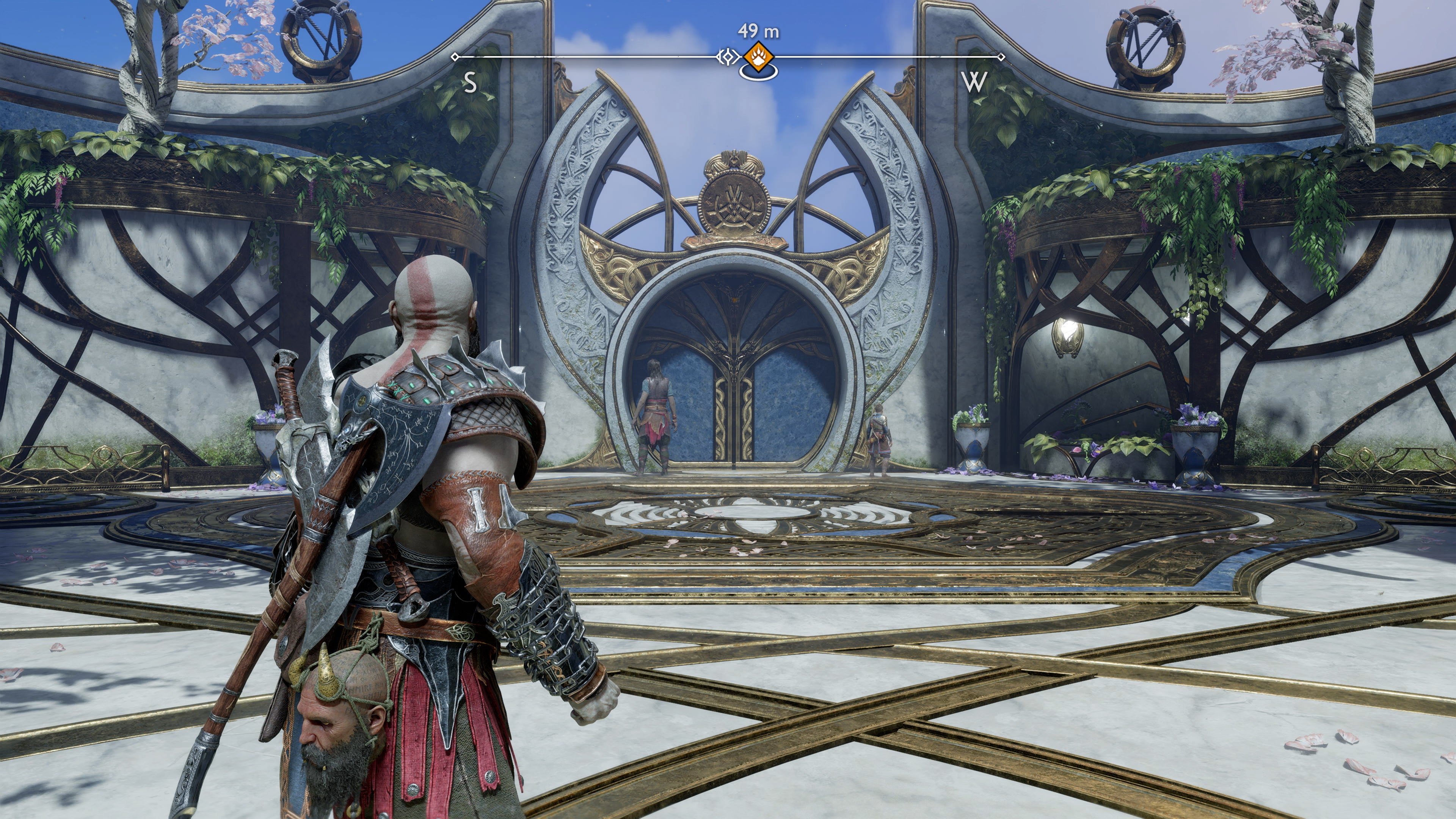
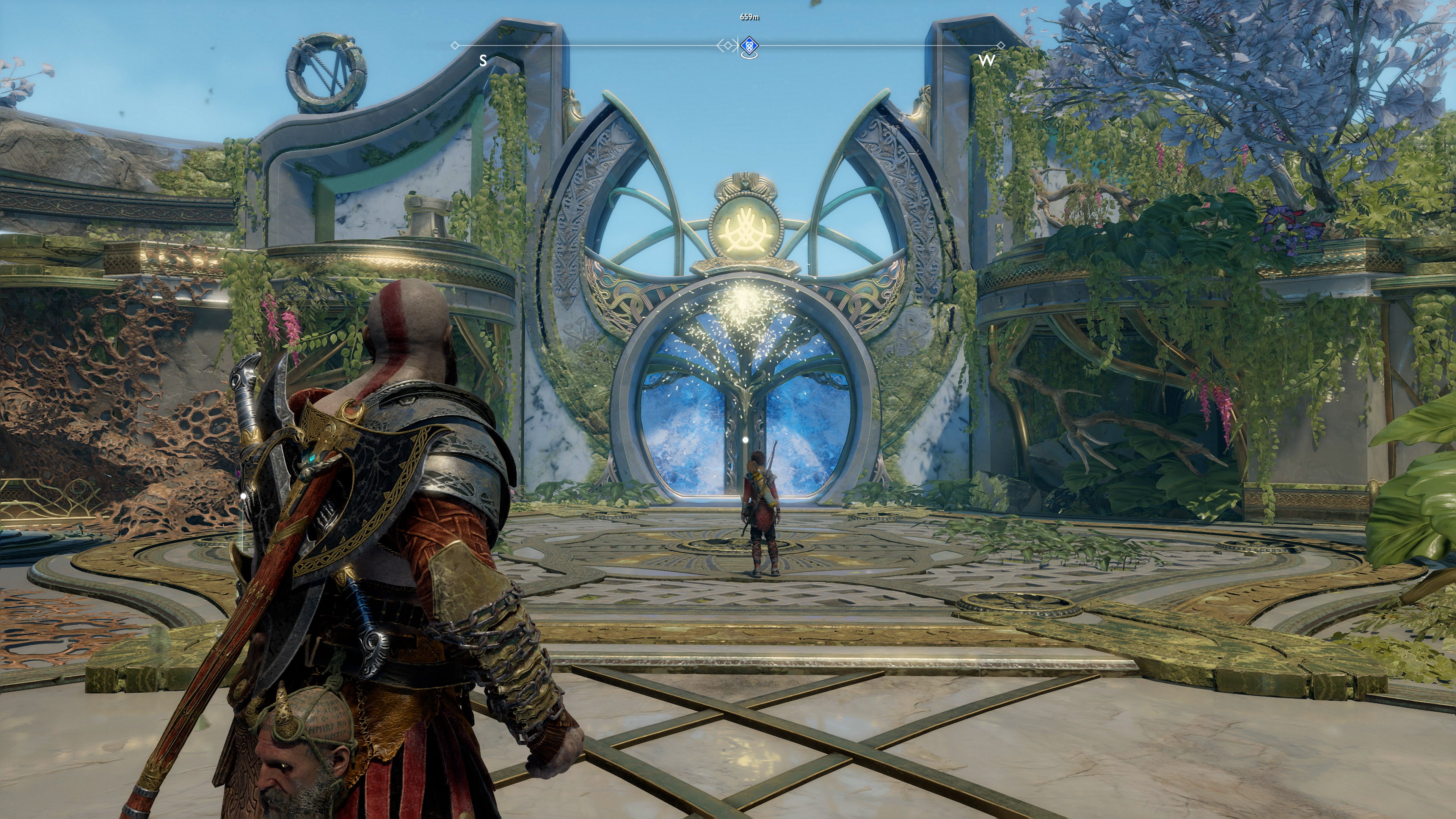
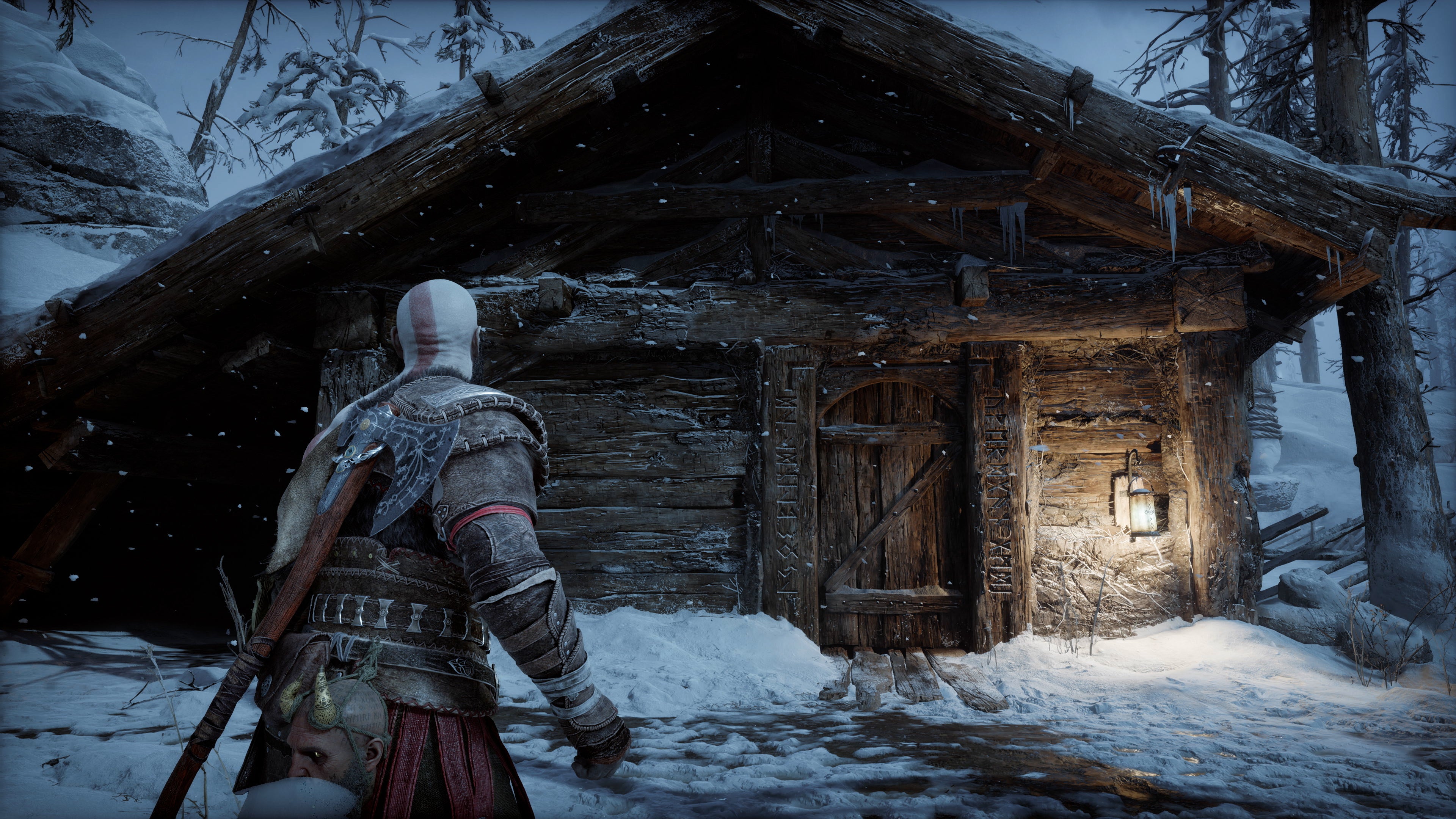
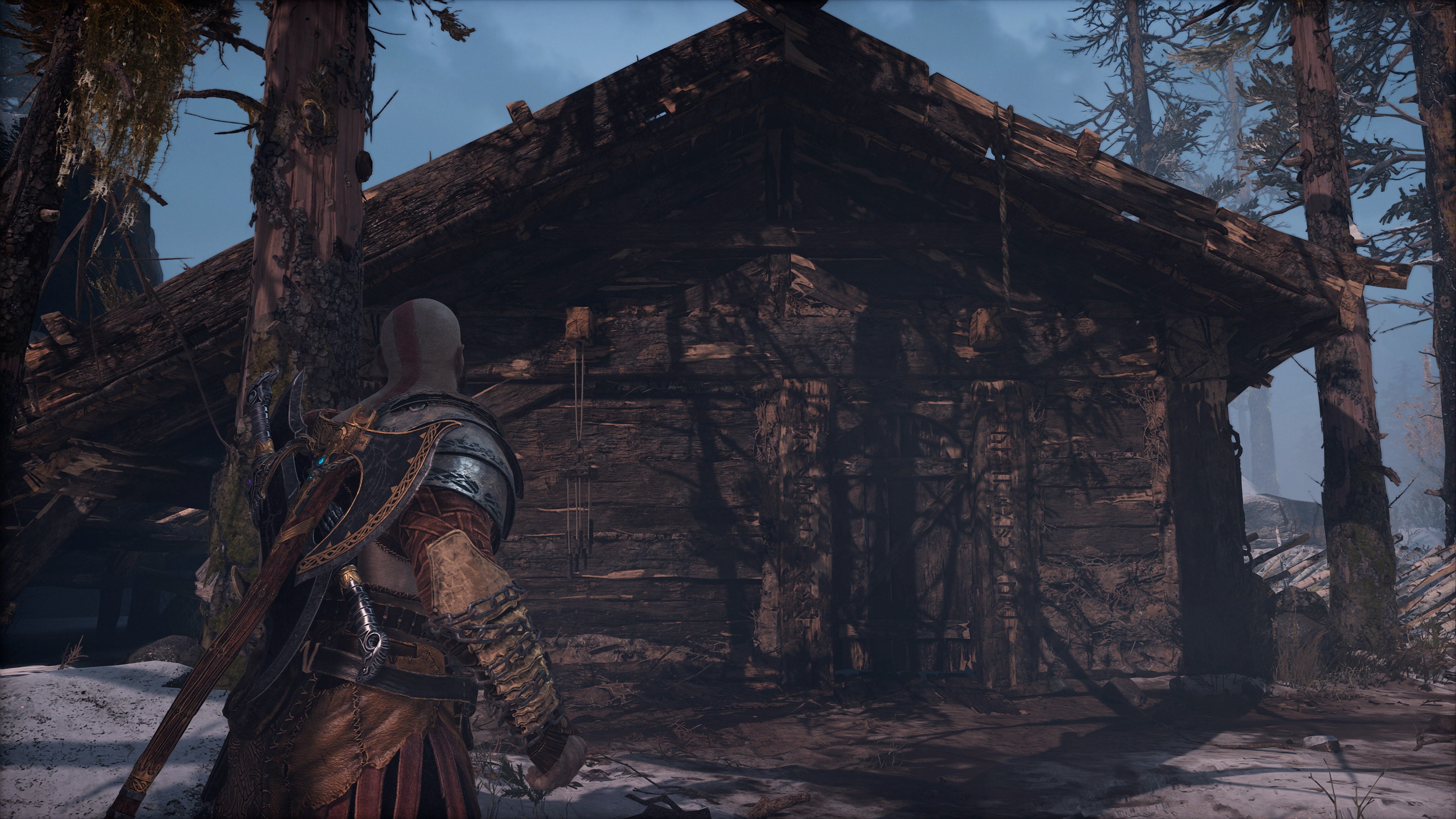
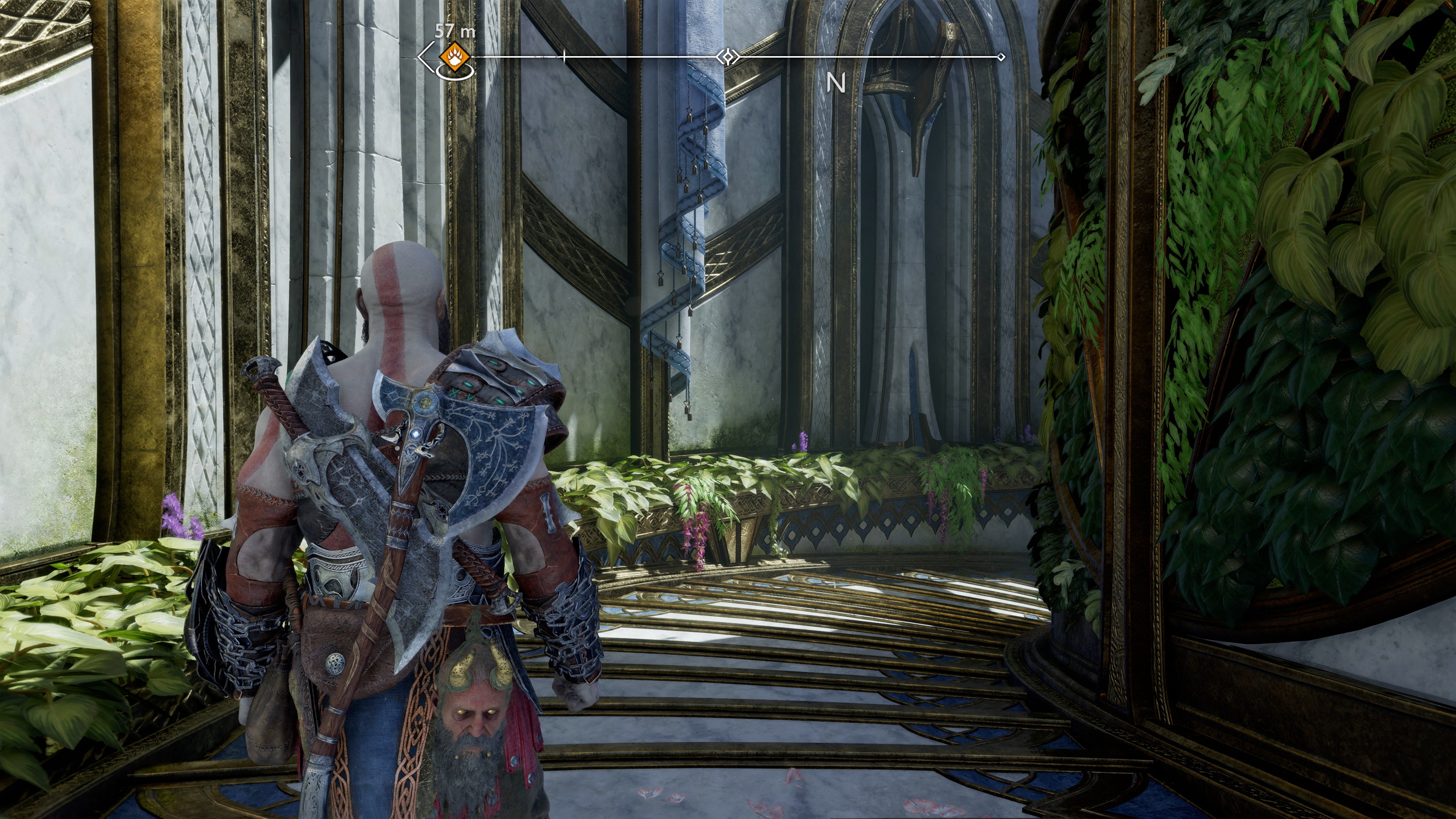
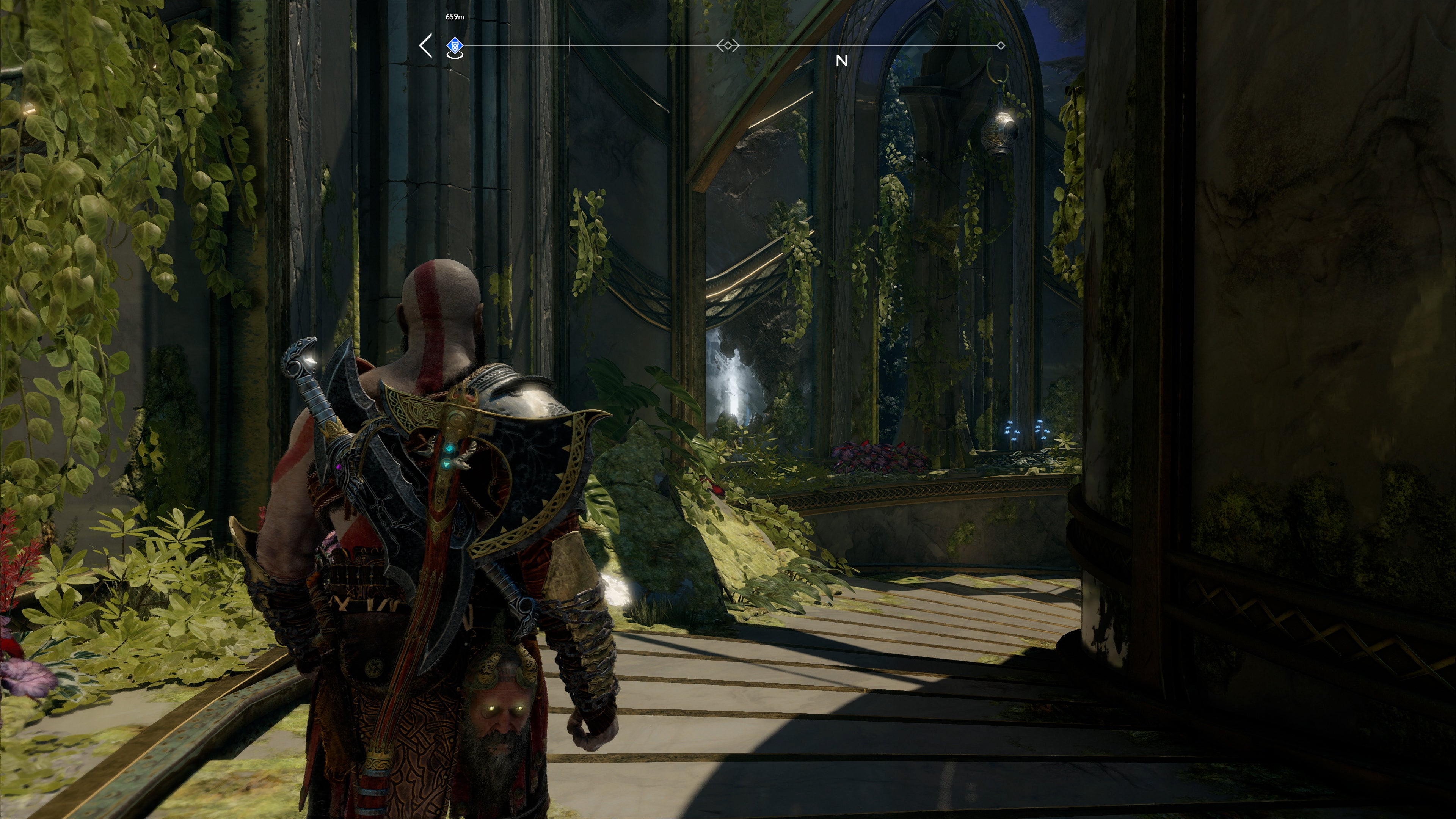
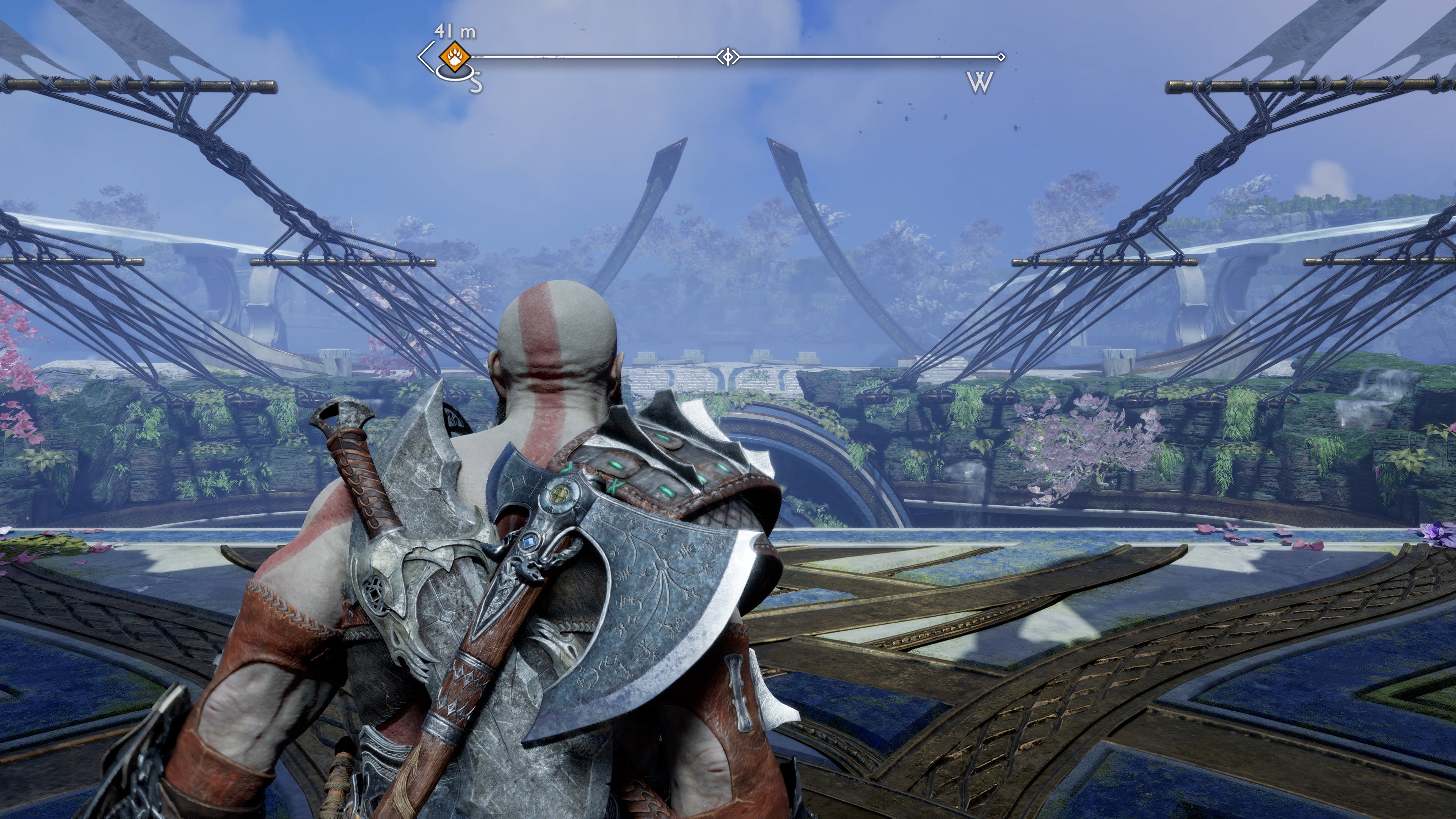
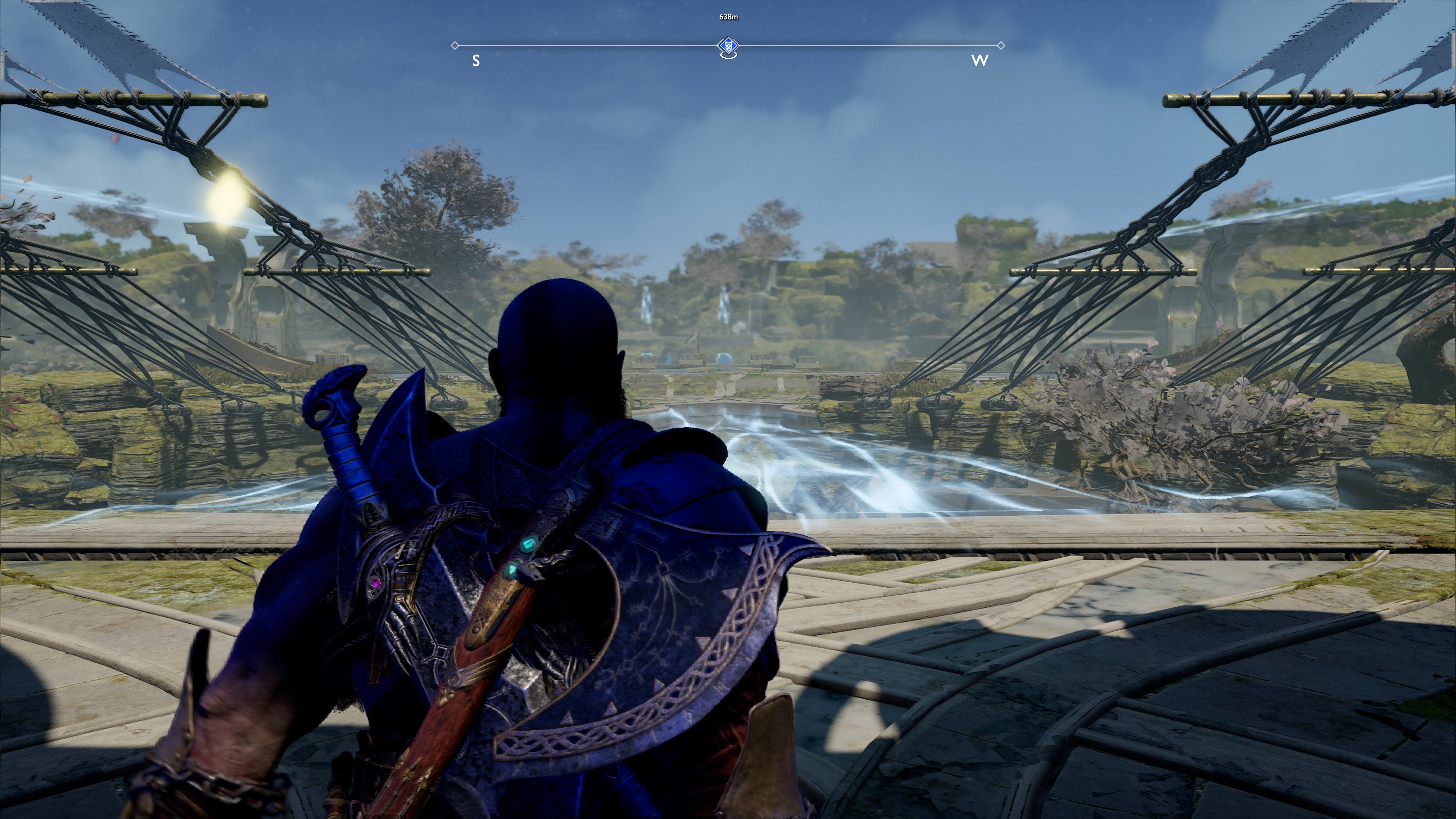
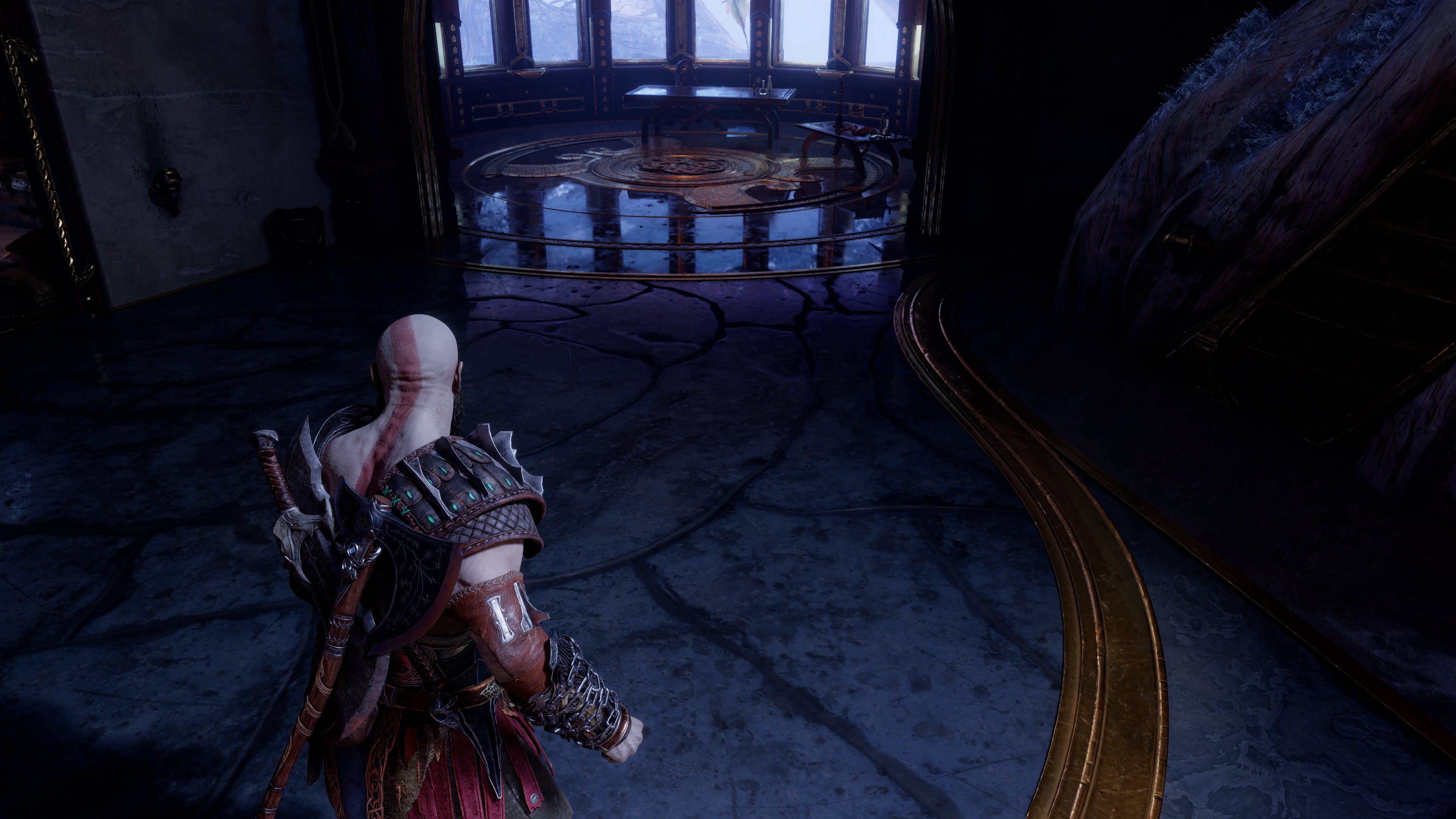
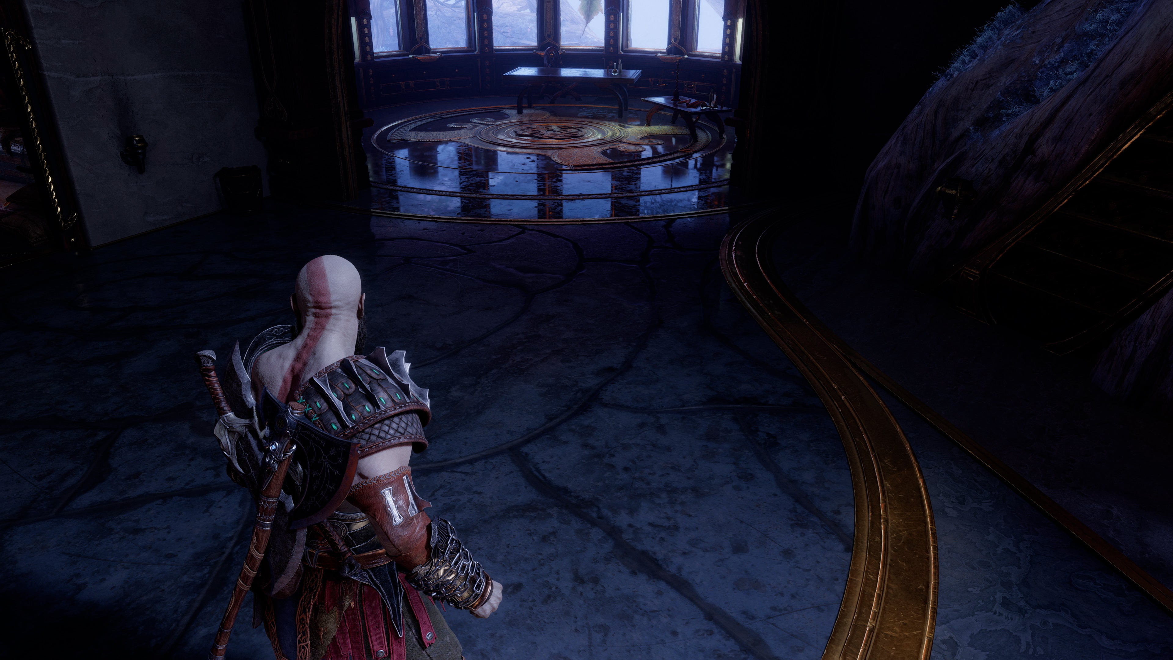
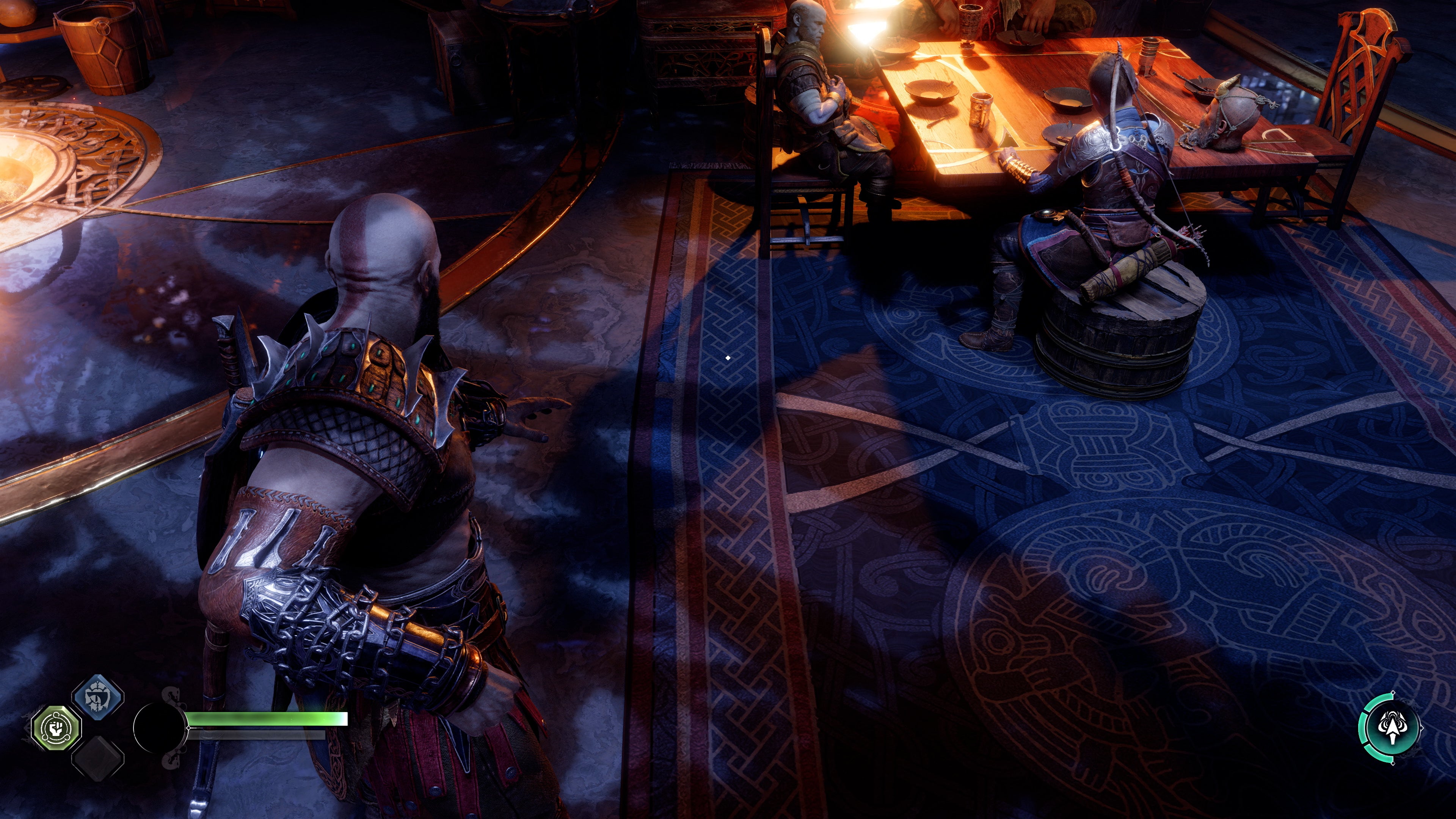
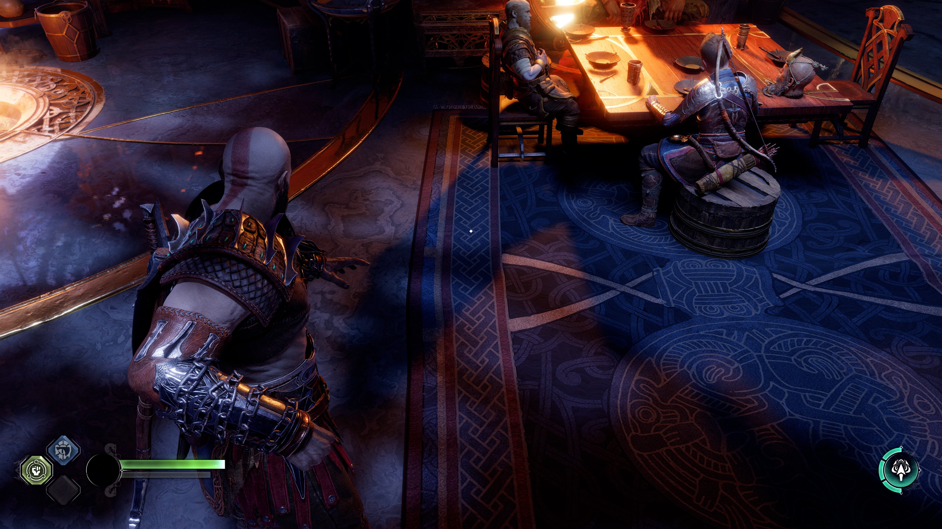
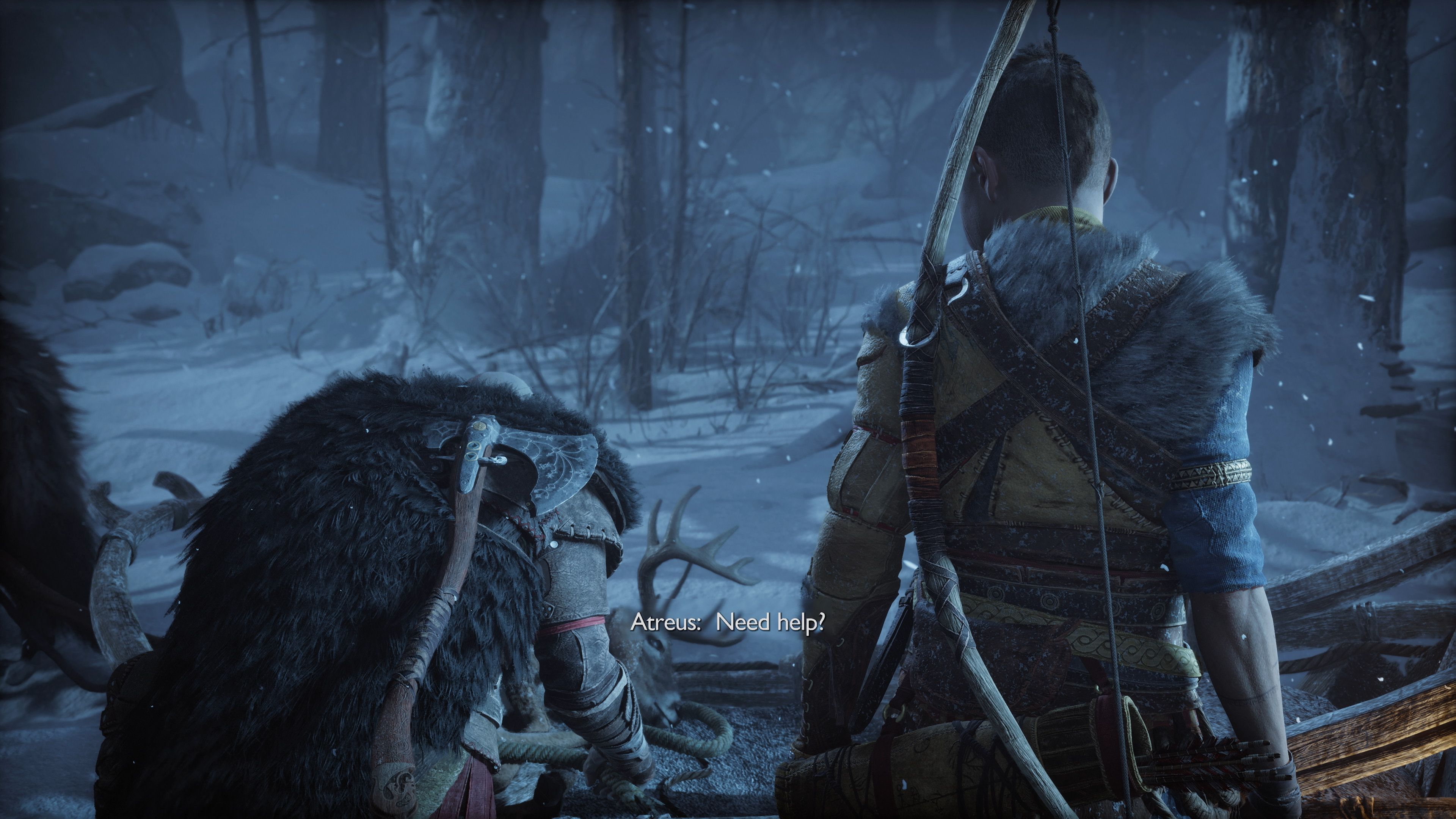
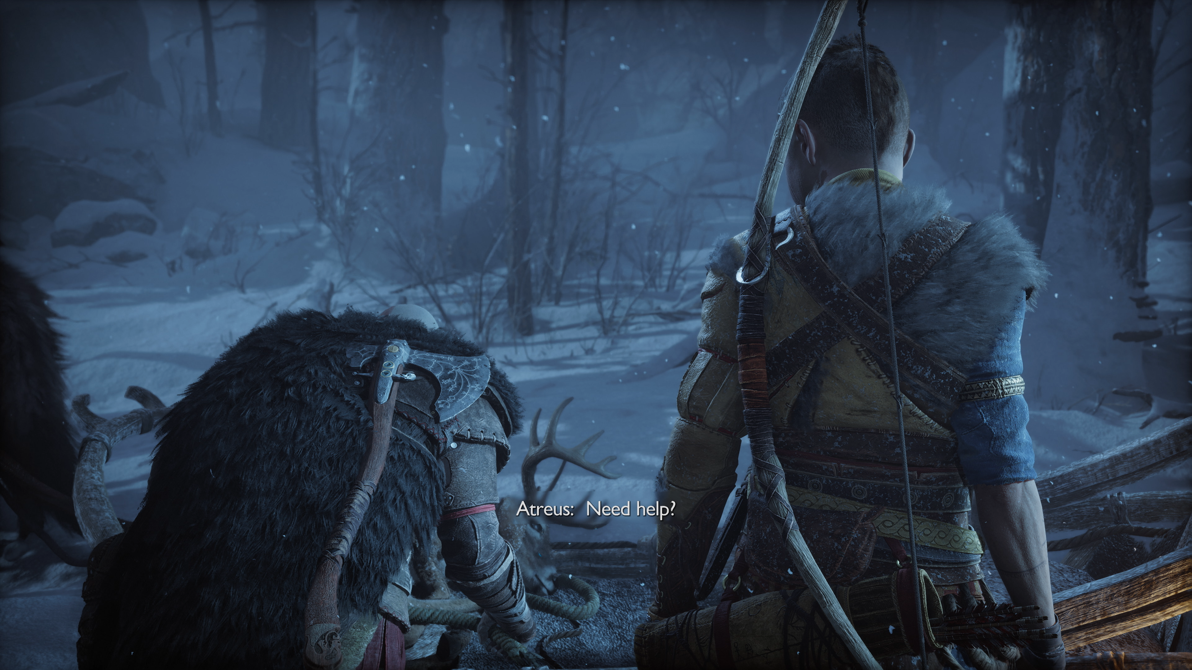
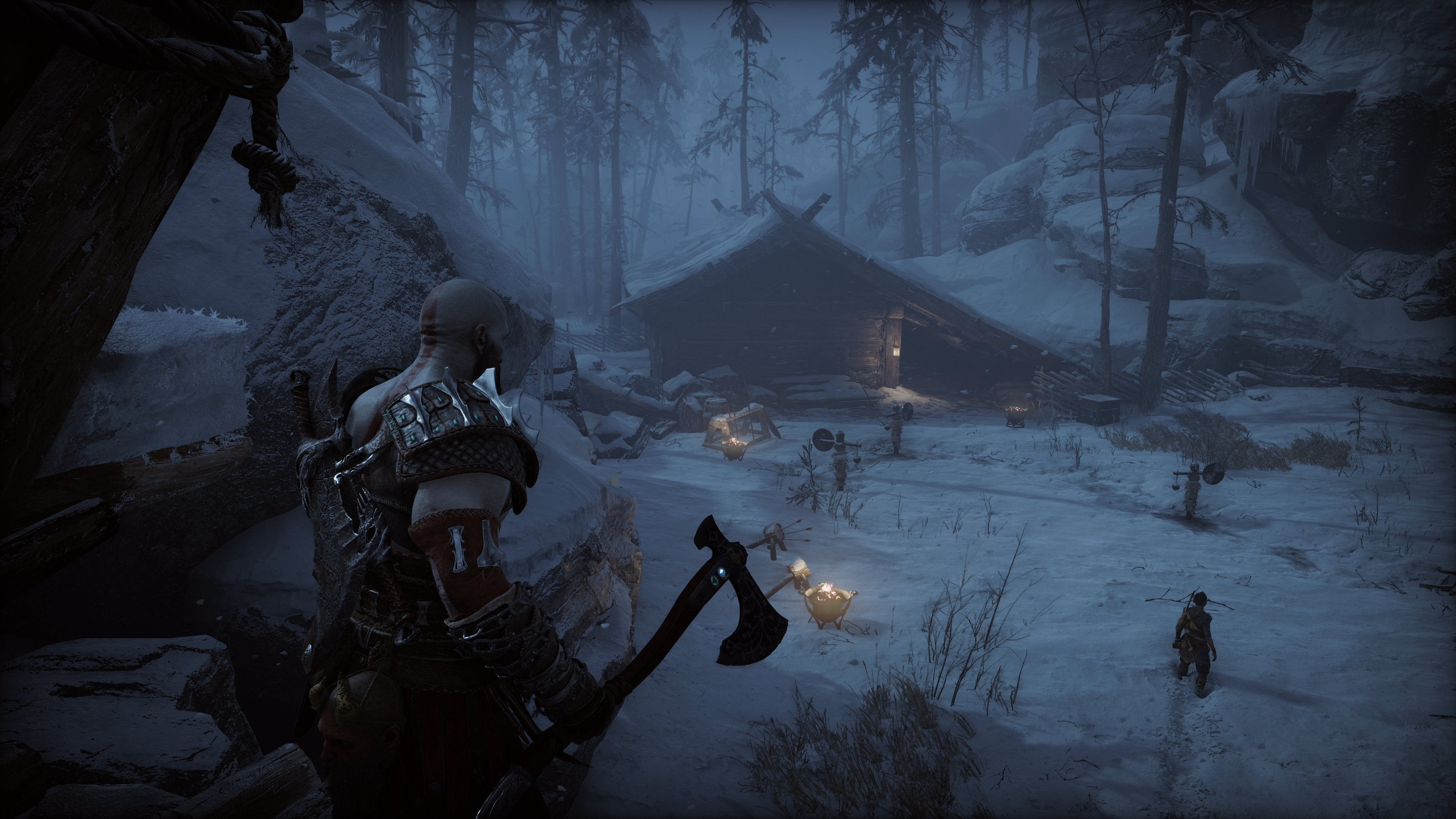
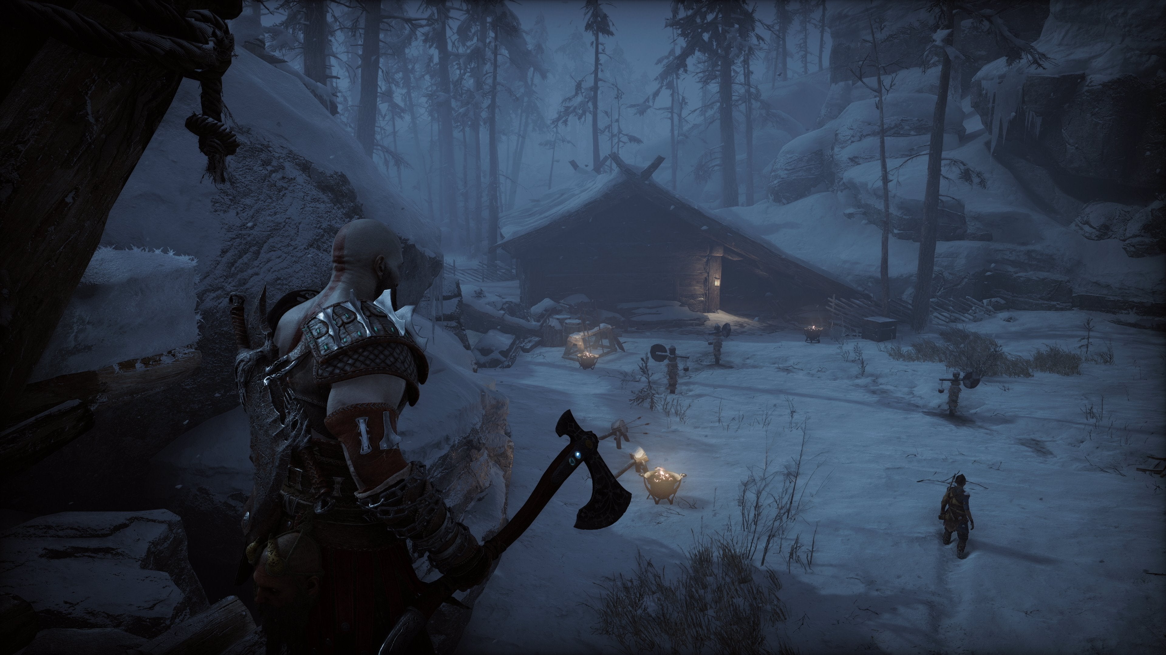
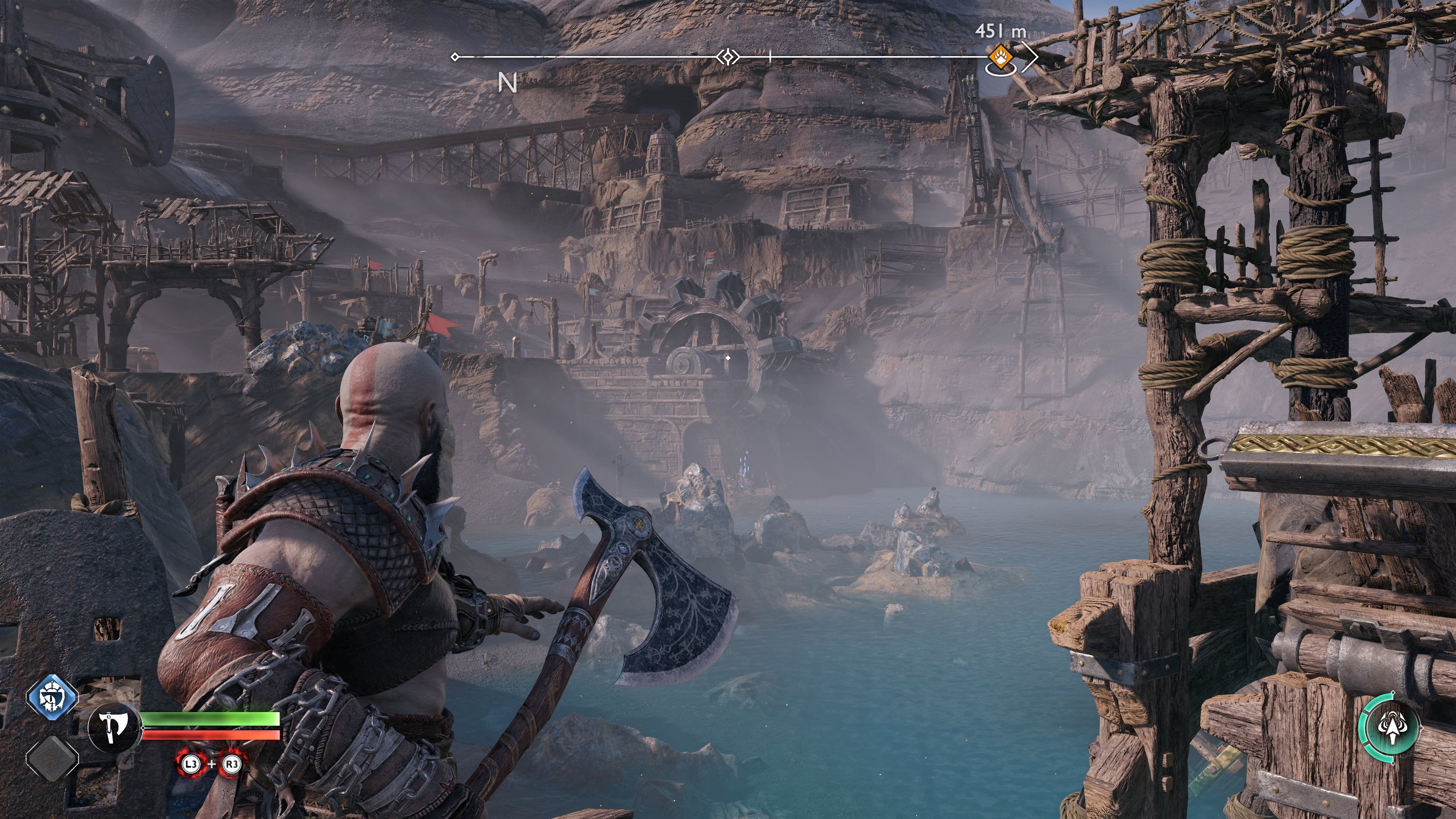
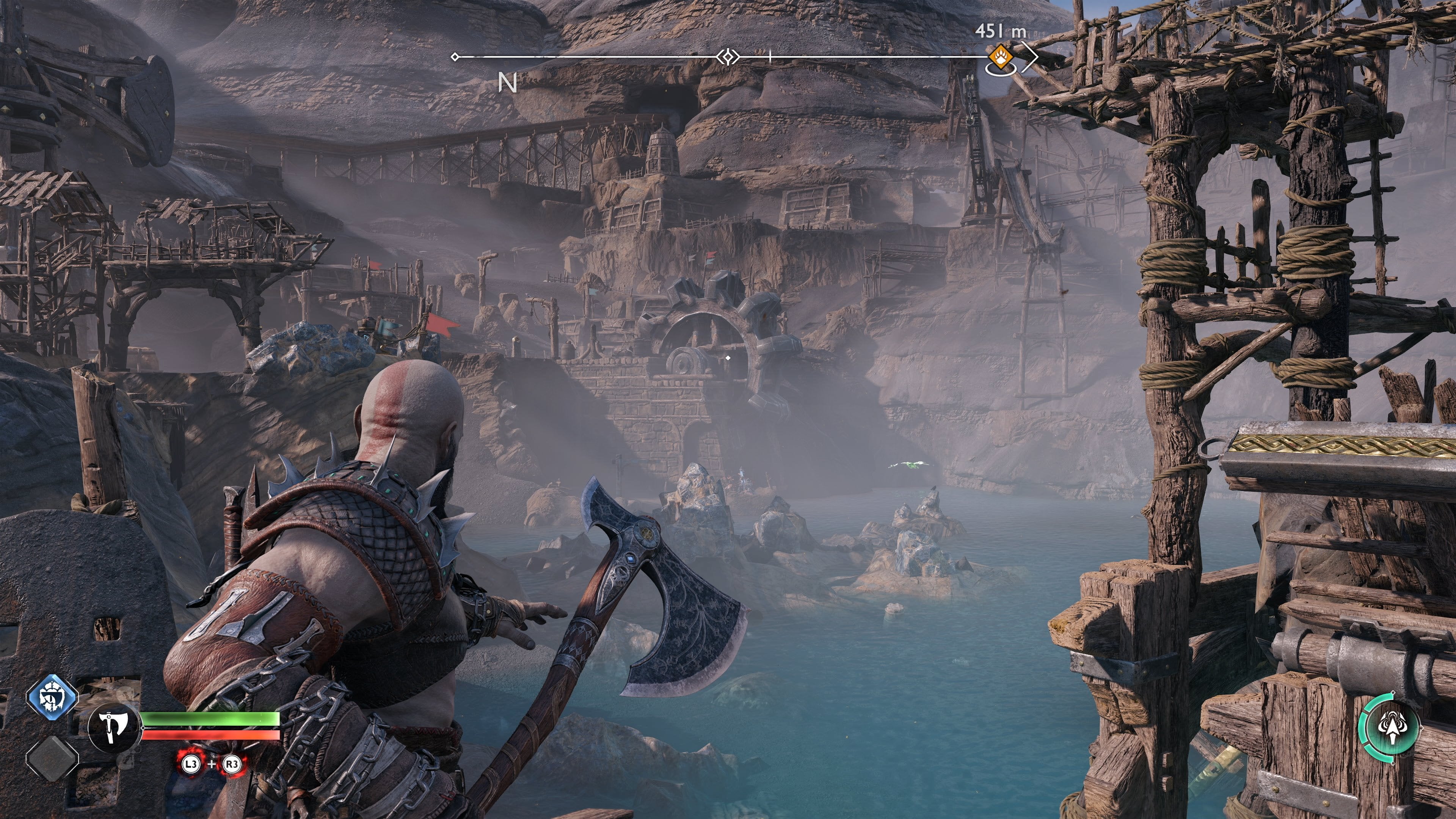
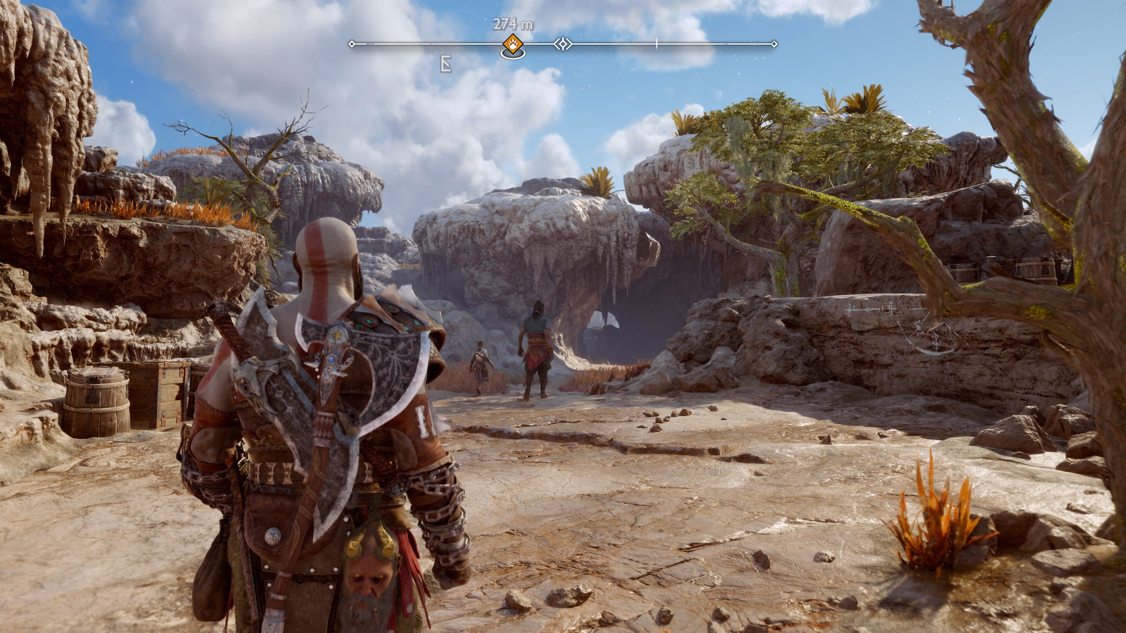
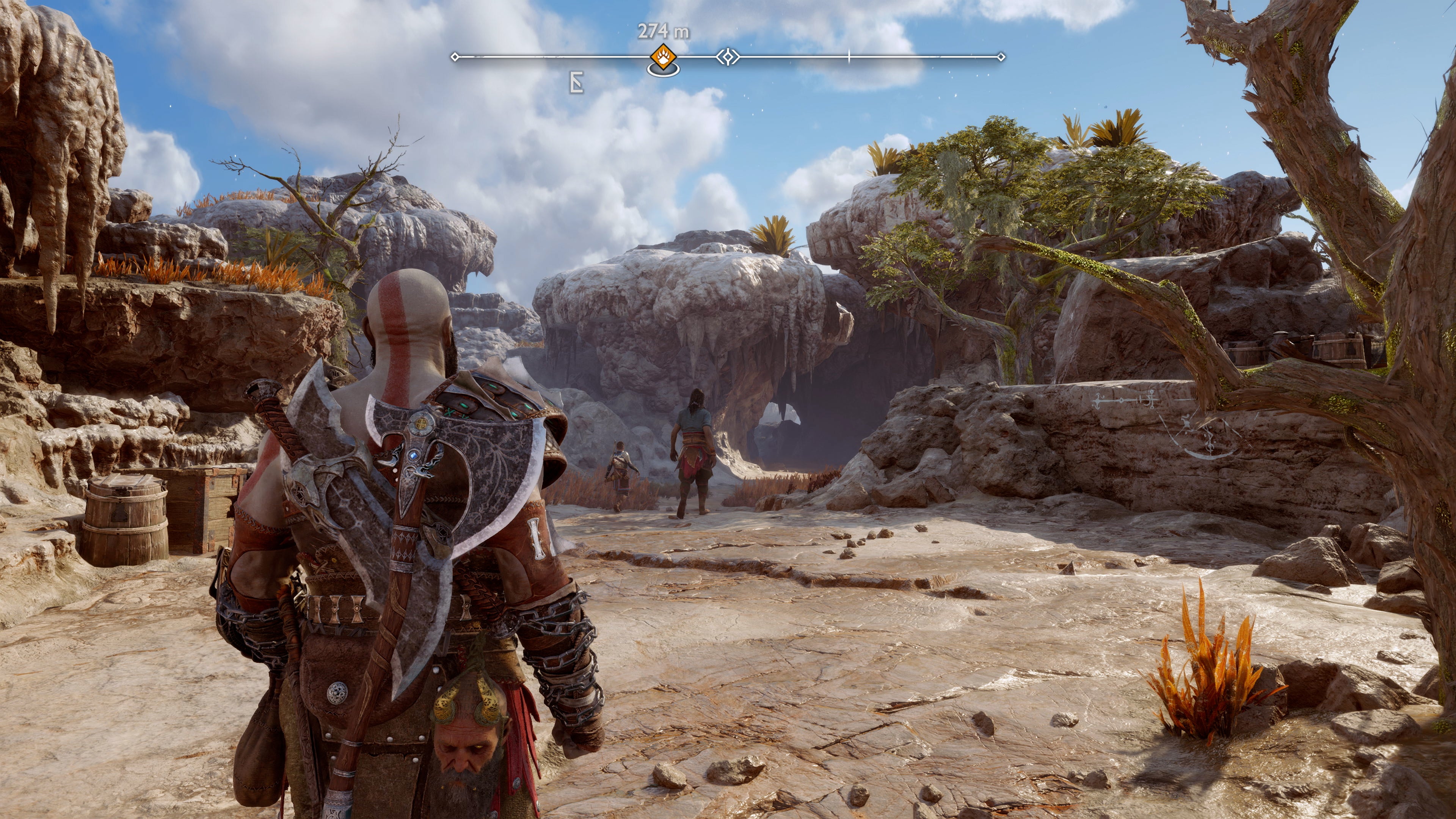
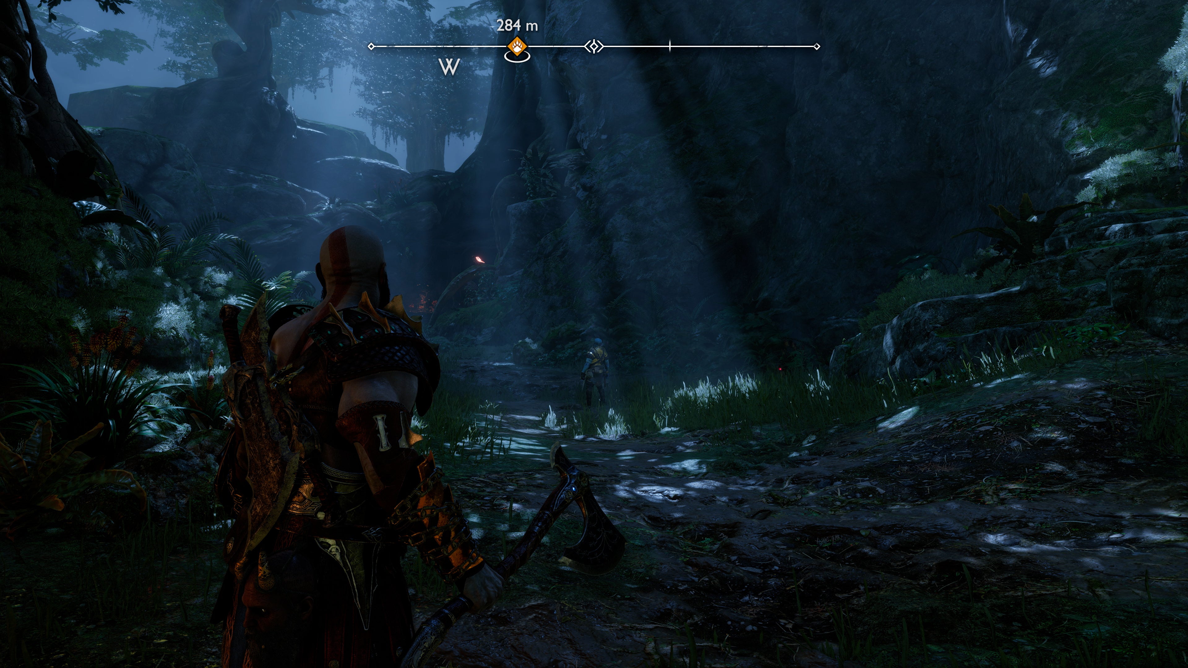
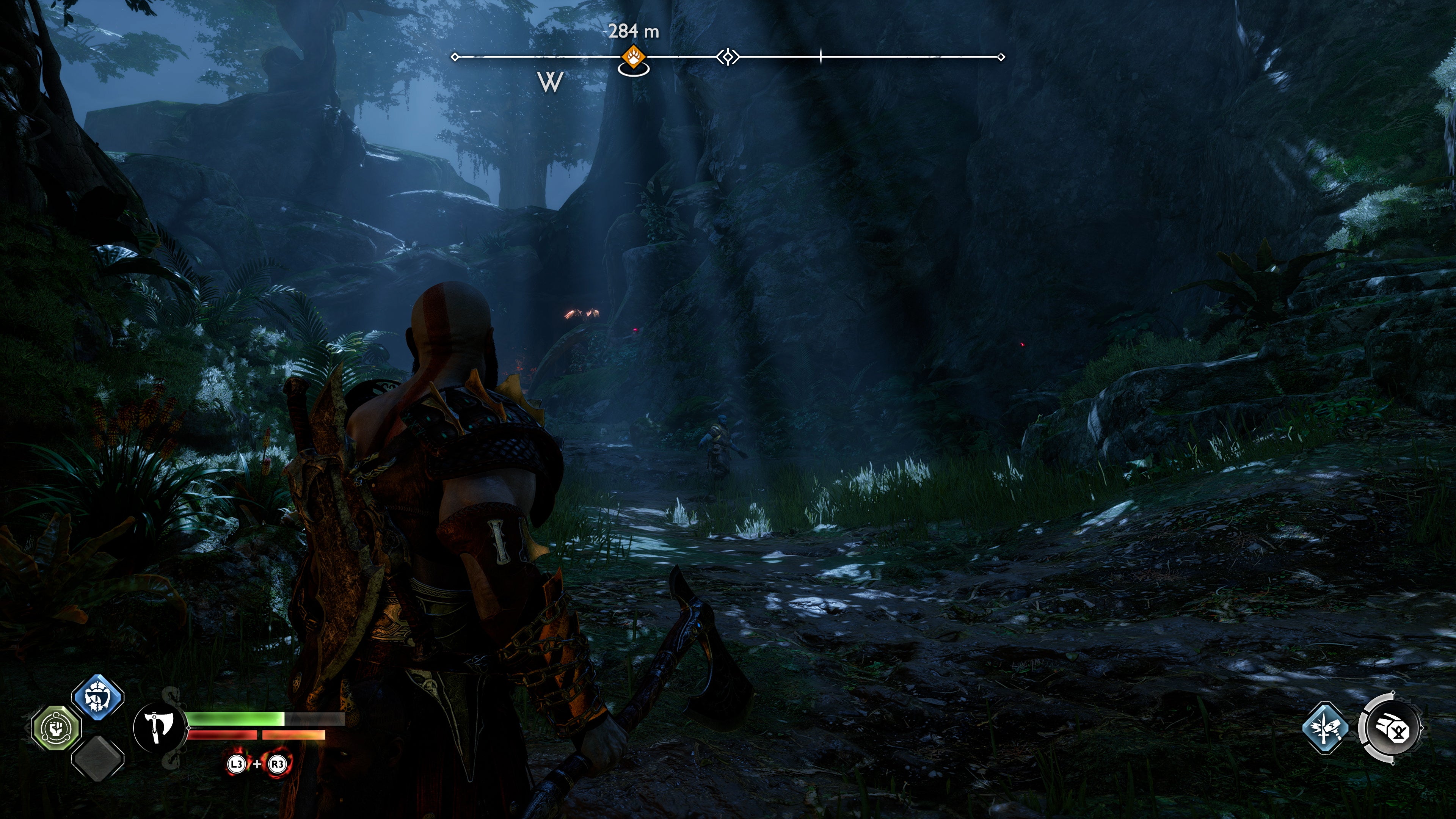
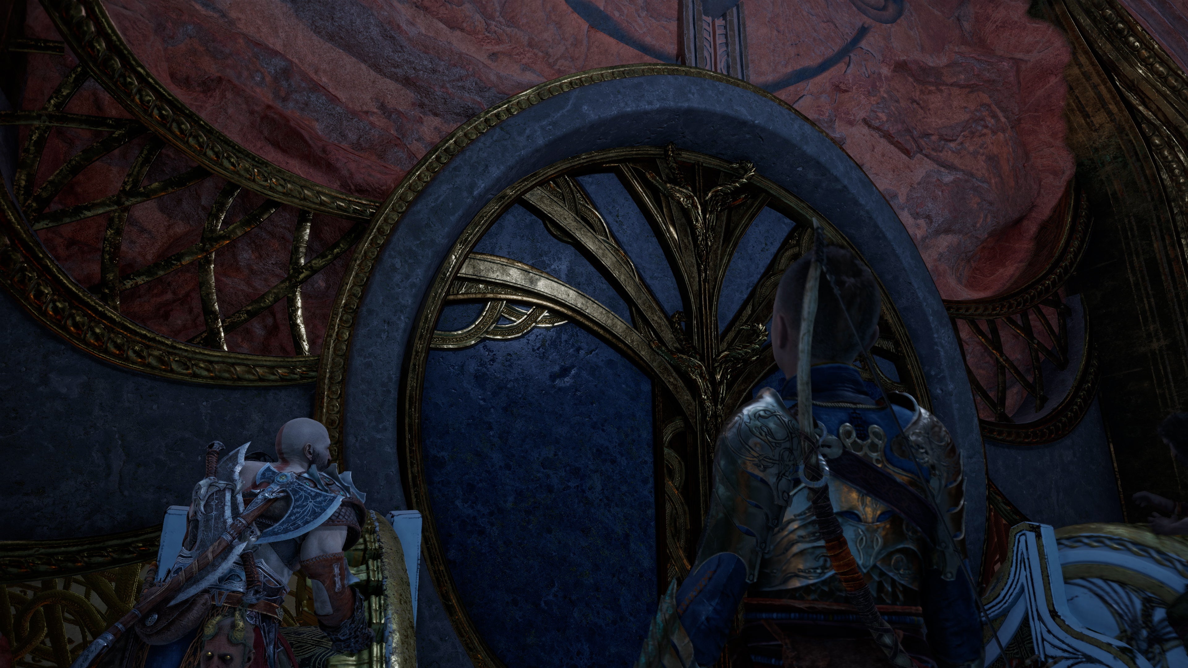
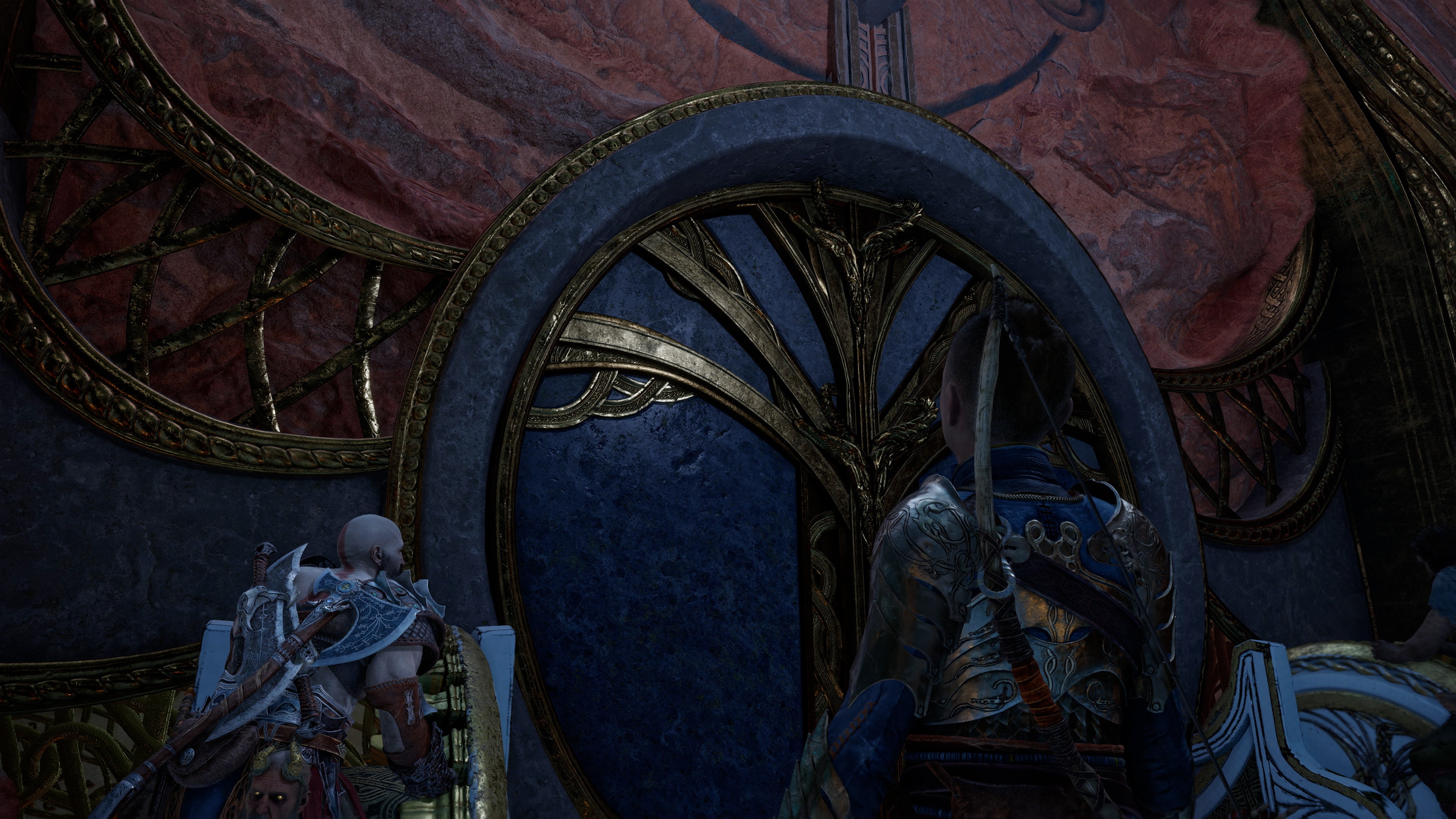
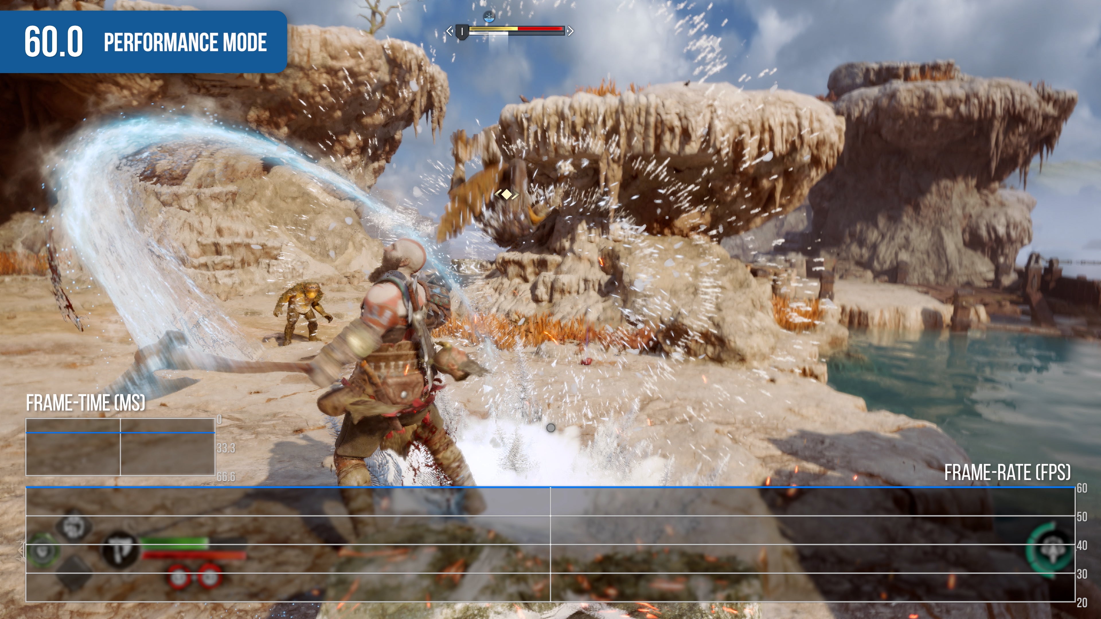
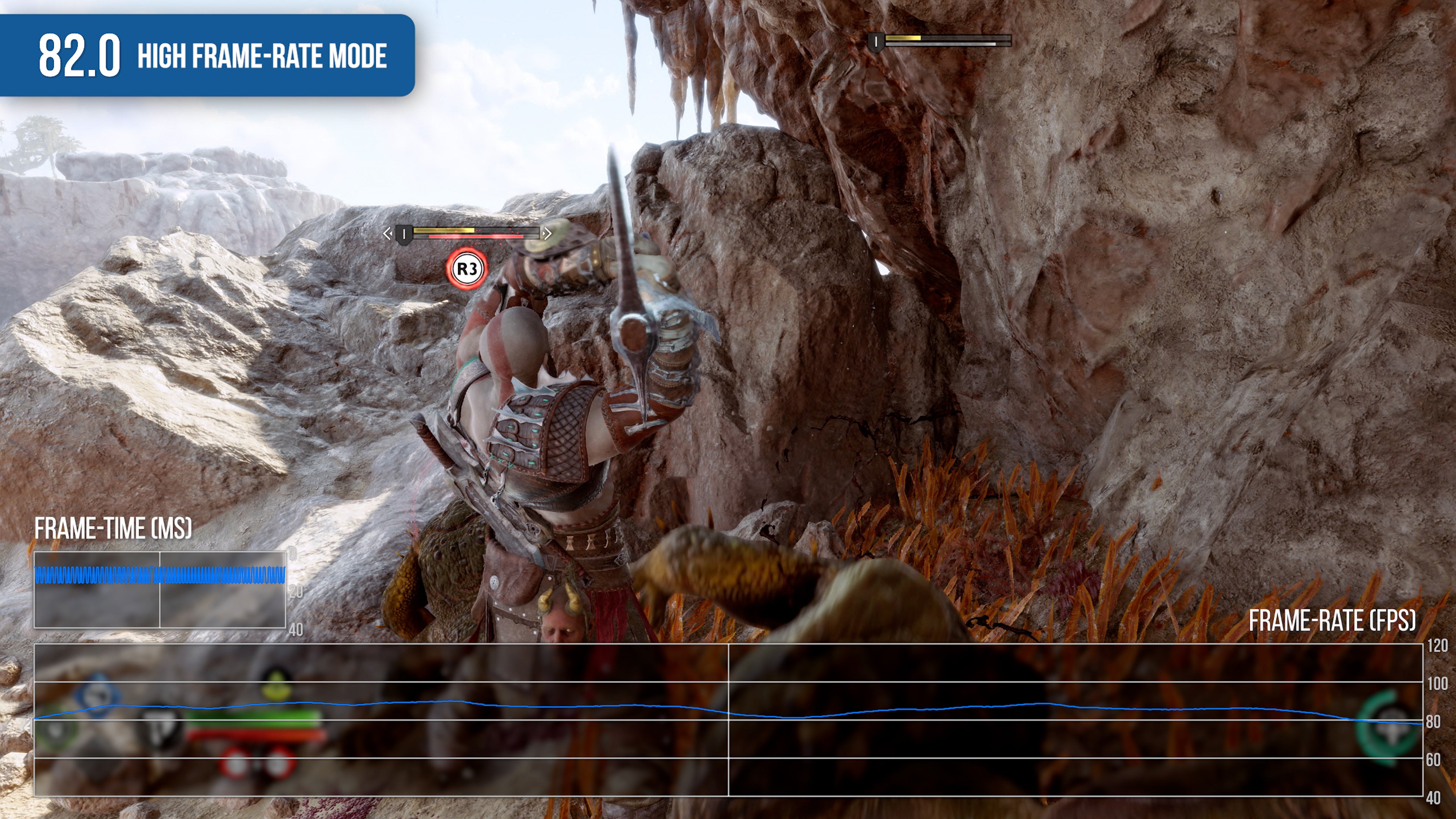
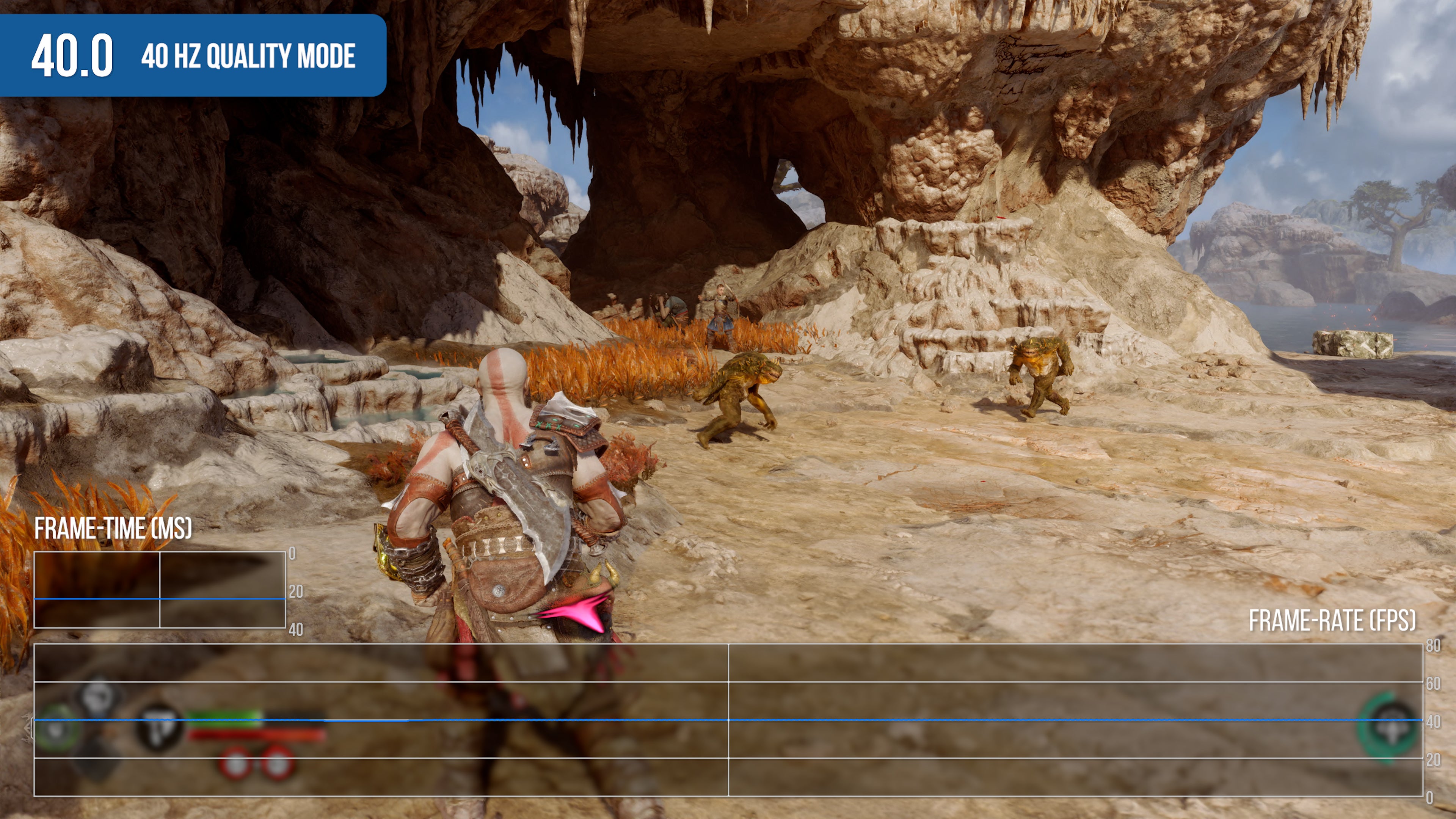
My first big takeaway is that Ragnarök’s presentation is remarkably polished. Modeling work is phenomenal throughout the game and across every single character and creature but it’s not just the designs themselves but the overall cutscene direction and animation work. From what I understand, these scenes are created using performance capture - that is, the motion and facial movement of the characters are captured and this data is used to build out each scene. While there are larger, action-driven scenes throughout, I was more impressed with the quality of the conversations between various characters. The facial expressions and body language really bring the characters to life in a way that makes watching them fully engaging. Like the original, God of War: Ragnarök is presented with a single, unbroken shot but this time, the game now features multiple playable characters. The seamless transition from Kratos to Atreus and back again really caught my attention - you basically enter a cutscene as, say, Kratos - it’s a seamless transition. As the cutscene comes to a close, however, the camera will find its way to Atreus instead where control is restored. Of course, there’s so much more to the presentation than characters alone and that’s where the world design comes into play. You’ll visit a wide range of environments over the course of the game and each one offers its own visual flavor. The strength of the Santa Monica team can be felt in the intricacies of each realm - something made possible via the game’s structure. Essentially, it follows the same hub and spoke design of the prior game rather than presenting a single open world. This allows the artists to build bespoke worlds suited to each piece of the overall narrative. It’s in these worlds that improvements over its predecessor become most evident. First and foremost, the game’s lighting has received a significant overhaul, especially when it comes to indirect illumination. Yes, it’s pre-calculated but it does a much better job approximating the behavior of light. The way it pours into enclosed spaces, indirectly illuminating the environment around Kratos tantalises the senses. This is perhaps the single most impactful enhancement over the prior game. God of War 2018 is a beautiful title no doubt, but indirectly lit environments often suffer from visible light leak and other issues related to the lighting system. With Ragnarök, the resolution of the pre-baked lighting is increased, significantly minimising light leaking as a result. This is then further augmented through the inclusion of screen space directional occlusion - a feature included in the PC version of the 2018 original. SSDO is used to approximate a single bounce of indirect illumination in screen-space complete with colour transfer. This helps better ground character and objects within the environment. Detail levels receive a boost as well - you’ll explore richly decorated landscapes, with ancient structures now withering beneath almost alien plant life while being treated with more dramatic, larger scale vistas on a more regular basis. Ragnarök is a very tightly directed game relying exclusively on bespoke assets created and arranged for each specific area within the world. The sheer volume of unique meshes and materials featured throughout the game is staggering. Enhanced tessellation is another feature on offer for PS5 users. This enables an increased level of detail within the ground surface which combined with the more physically accurate materials, produces far more detailed results. Snow deformation also makes a return and on PS5, the tessellation quality is increased over the prior game allowing richly detailed trailers to form as you navigate the snowy landscapes. The aftermath of a snowy battle leaves trampled snow in its wake. Another aspect critical to the simulation of light are reflections, an area where I feel the prior game fell flat. Many areas rely on exceptionally low-resolution cube-maps exclusively while the implementation of screen-space reflections felt constrained, especially when it comes to water rendering which was a weak point. God of War: Ragnarök rectifies this in a couple different ways. Firstly, while true hardware accelerated ray traced reflections are not featured in this game, it does seem to utilise a solution like Mafia: Definitive Edition where rays are traced into a cube-map with high quality lighting data baked into it to determine the most appropriate colour but also trace into a more accurate version of the scene geometry to determine the best cube-map placement. This is then combined with a greatly improved implementation of screen-space reflections which now extend deeper into the reflective surface producing a much more pleasing result compared to the prior game. But how much of an upgrade is it really? This is where things get interesting. It’s clear that the team has made improvements over the prior game on a visual level, but it feels like a natural evolution. During your time with the game, you will revisit certain locations from the last entry and this allows us to directly compare with the 2018 original. Firstly, the home of Kratos is a good starting point - from the introduction, the weather and time of day differ slightly, but I feel the lighting is a nice improvement. His home is more visually striking in the sequel with deeper shadows and a more defined silhouette. Looking across the field in front of his house, the surface of the snow is more nuanced, and the distant background features more trees. There’s no doubt, however, that it feels largely familiar from a technology standpoint - but it certainly is beautiful. Skipping ahead to Alfheim, you cross paths with the original game here as well. We can see that it has evolved under control of the light elves, but the comparison is striking. The improvements are certainly evident but the original holds up surprisingly well. Going back and forth between the two games, I walked away with mixed feelings - on one hand, it doesn’t necessarily feel like a gigantic leap forward from a pure technology standpoint but the deeper you dive into the world, you’ll begin to appreciate the assortment of enhancements included this time around. Ultimately, my feeling is that the gap between PS4 and PS5 is less pronounced than in, say, Horizon Forbidden West - and we’ll have follow-up coverage on that on launch day. However, the cross-gen nature of the title has its advantages. More than just about any game I’ve played this year, God of War: Ragnarök feels unbelievably polished, even in its pre-release form. There are effectively no stutters, hitches or any other weirdness. I’ve encountered no bugs or visual glitches and everything feels polished to perfection. It may not be pushing the technology envelope, but the presentation is so beautifully realized and tightly put together it’s hard not to be impressed. This becomes even more evident when taking the various graphics modes into account. When played on a PS5, God of War: Ragnarök features four unique graphics options with two of these locked behind display capabilities. On a normal 60Hz display, players have access to both a higher quality mode and a performance mode but when paired with a 120hz capable TV, you also gain access to a 40 frames per second quality mode and an ultra-high performance mode. Let’s begin with the default performance mode. I believe this will become the most used mode in this game - image quality is excellent, and the frame-rate target is 60 frames per second. In comparison, the quality mode caps the frame-rate at 30 frames per second while improving the visuals. Quality mode renders at a full native 4K while performance mode instead uses dynamic resolution scaling ranging from 1440p up to 2160p. On average, pixel counts reveal that it spends most of its time around 1872p. What’s new this time, however, is the inclusion of TAA with upsampling. This TAAU solution helps even lower pixel counts appear suitably 4K and as a result, image quality is greatly increased over the prior game. The two modes look very, very close. If you look very closely, however, you may spot one of several key differences. Firstly, the two modes feature completely different LOD settings - distant detail exhibits additional detail in the quality mode. The implementation is very smart, however, as you’re unlikely to perceive any sort of difference without direct comparisons - it isn’t as simple as culling objects from view, the entire scene is carefully adjusted based on the selected setting. Additional adjustments include fur, which is rendered at higher quality, and shadows. Quality mode also features contact hardened shadows which produce a variable width penumbra in shadow-casting scenes. The quality mode also features additional lights in certain scenes and enhanced sky lighting. Between the two, I’d have to give the nod to the 60 frames per second mode. The boost in image quality in the quality mode doesn’t make up for the lower level of performance and visual quality is still comparable overall. The only real issue I could raise centres on motion blur - the shutter speed isn’t adjusted to match the higher frame-rate options so, the higher you go, the less pronounced the effect becomes. Still, performance in the 60Hz modes is exceptionally solid: the 30 fps quality mode delivers a stable 30 frames per second and it’s completely locked, with no visible stutters and the frame-pacing is flawless. The 60fps performance mode? Even in the most stressful scenes I could find, frame-rate never wavered from a full 60fps lock. Moving into the 120Hz modes, the quality mode moves up to 40fps, with an 1800p to 2160p dynamic resolution window. Variations in resolution are very difficult to see. The high frame-rate mode, however, is limited to 1440p output with temporal upscaling greatly enhancing its appearance. The 30 and 40 fps quality modes both seem to mostly share the same level of detail while the 60fps and high frame-rate options share the same visual setup too. This basically means that we’re looking at two unique modes in terms of visual quality so with a capable display, there’s no reason why you should not just go ahead and use the 120Hz modes. The two performance modes are the most interesting - if you have what seems to be equivalent visuals between the two, what is the use case for each one and what kind of performance will you actually get? The high frame-rate mode basically removes the 60fps cap and bottoms out the resolution at 1440p, allowing the frame-rate to reach for 120 frames per second instead. The reality, however, is that we’re mostly looking at a performance between 80 to 90 frames per second in most scenarios. It can occasionally jump above and below this point, of course, but by and large, this is what you’ll get during gameplay. Compared to 60fps, it’s a significant jump, allowing more responsive and fluid gameplay. However, there’s a catch - while you can enable this mode on any 120hz capable display, if you cannot utilize VRR, I would strongly suggest sticking with 60fps instead due to judder. Of course, if you can use VRR, this quickly becomes my preferred graphical mode. It really shines at such a high frame-rate and it’s unlikely we’d have had access to this option if not for the fact that it’s a cross-gen release. The 40fps mode is perhaps less interesting data wise but the news is still positive - much like the 60Hz quality and performance modes, the frame-rate is locked. It sticks to 40 fps and simply doesn’t budge in my testing. This is a great option for those that prefer the quality mode visual setup but need a slight boost in fluidity. I’m extremely happy to see this option becoming so common in games as of late too and it doesn’t disappoint. Even better, this mode work great even without a VRR capable display as it divides evenly into the 120Hz refresh rate. So, given this information, let me summarise what the best ways to play the game on PlayStation 5. If you have a modern high-end TV with 4K 120Hz support, I would suggest the high frame-rate mode. It feels the most responsive and you really lose very little in terms of overall image quality and detail. It looks fantastic. If you do not have such a TV, my suggestion is to stick with the 60Hz performance mode instead. You get a perfectly stable frame-rate and excellent visual quality - it’s one of the most stable 60fps games I’ve seen on consoles. My main complaint here is that the quality modes don’t offer as much of a leap as I’d have liked. It feels like there’s a ton of headroom and this mode would benefit from something like ray-traced shadows, which are very usable and fast on this class of AMD hardware. In its current form, however, it’s tough to recommend the quality mode.PS5 is utilised in other ways, however. Loading times are improved. While the game plays out seamlessly if you play straight through, there are loading screens when loading a saved game and on PS5, these average around 10 seconds ,which is 20 seconds faster than loading a save on PS4 Pro. So it’s an improvement but not necessarily a game changer as we saw in games like Marvel’s Spider-Man. Then there’s the Dual Sense controller which is used as expected - the controller feedback and trigger use is well implemented and not distracting. I wouldn’t say it’s a game changer, but it is certainly an improvement over the Dual Shock 4 on PlayStation 4. And that brings us back to the topic of cross-gen - God of War: Ragnarök is unabashedly a PlayStation 4 game that has received an enhanced release on PS5 and, overall, it does work out, but my feelings are slightly mixed. The benefits of this approach include extremely high levels of performance and polish. I’m fairly certain that a ‘from the ground-up PS5 God of War’ game would not deliver a completely locked 60fps let alone the 80-90fps you get in high performance mode. In a sense, playing this on PS5 feels like playing any other multi-platform game on a gaming PC. It’s the same experience but improved and that is a good thing. Yet, when examining the overall game structure, I can’t help but consider the other possibilities. I wouldn’t want to see God of War become an open world game, mind you, but there is a sense that all the little animations, crawl spaces and tight squeezes slow the overall pace down. Could the developers push the world design out further if it had been an exclusive? Maybe, maybe not. When it comes to visuals though, I do feel that Ragnarök is a triumph overall. Yes, the experience is similar between all three consoles but it’s still one of the better-looking games of its ilk on the market and does take advantage of PS5. It’s not a generational leap over the prior game, mind you, but a natural evolution of what was previously achieved. I’ll certainly be curious to see where the team goes next but given the amount of time required to create a game like this, I suspect it will be a long time before we see new projects from Santa Monica Studio. In the meantime, enjoy God of War: Ragnarök - it’s a stunning, involving game with exceptional layers of polish.
